Case Study
Digital World
A reflective case study documenting how I designed, built, and launched this portfolio to showcase UX, UI, branding, research, prototyping, and development skills in one cohesive experience.

01 — Introduction
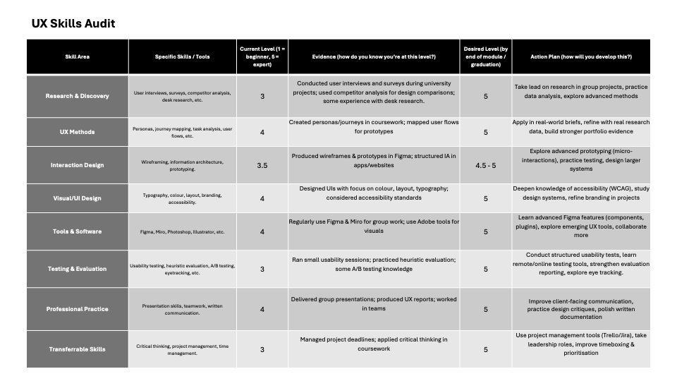
This project focused on crafting a professional online presence to support my growth as a UX and Product Designer. A skills audit highlighted strengths in research, interaction, UI, branding, and storytelling — all anchored in this portfolio experience.
02 — Moodboard & Visual Direction
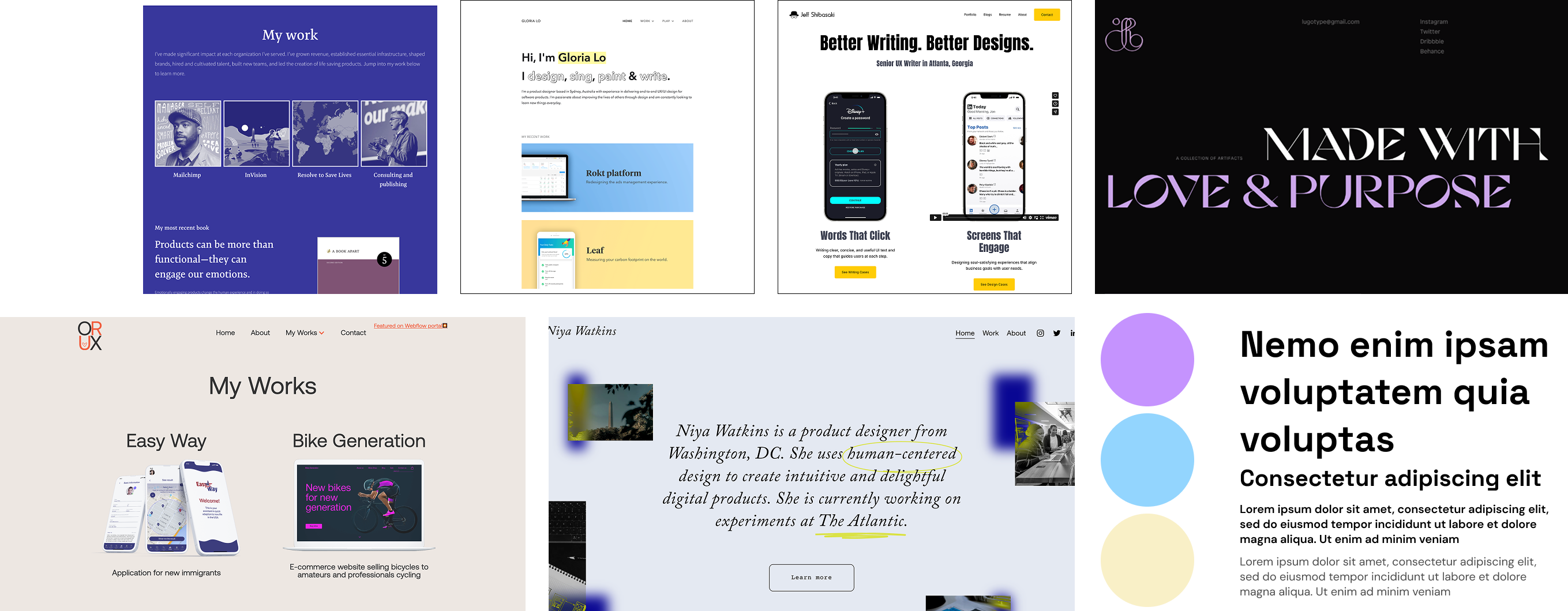
The moodboard explored playful yet professional visual directions, combining bold typography, soft neutral backgrounds, sticker-inspired graphics, and bright accent colours. This style reflects my design personality: friendly, expressive, and human-centred. Influences were drawn from modern UX portfolios that balance character with clarity (Bestfolios, 2024).
03 — Sketches & Concept Development
Early sketches explored the homepage layout, case study structure, and navigation hierarchy, allowing rapid testing of visual flow before moving into digital layouts. As the portfolio is built around a homepage and a reusable case study template, only two core wireframes were required, ensuring consistency and efficient iteration for recruiter-focused scanning (Marcotte, 2011).
 Wireframes
04 — Tool Choice & Build Process
The portfolio was built using HTML, CSS, and Bootstrap, allowing full control over layout, accessibility, and responsive behaviour. Unlike pre-built website templates, this approach enabled complete customisation of branding, animations, and interactivity. While platforms such as WordPress offer speed, hand-coding the site strengthened both my front-end skills and my understanding of responsive UX implementation (W3C, 2019). The website is hosted using GitHub Pages, supporting version control and live deployment, with plans to transition to a custom domain to further strengthen my professional digital identity. The site was iterated continuously using live browser testing and device responsiveness tools, resulting in smoother navigation, improved contrast, and stronger mobile performance.
 Image of VS Code
05 — Design Style Guide
The final style guide features Space Grotesk for headings and DM Sans for body text, supported by a warm neutral base and bold accent colours. Accessibility considerations included contrast-safe colour ratios, readable line spacing, and large tap targets, aligning with WCAG guidelines (W3C, 2018). The playful sticker branding evolved naturally from the initial moodboard exploration.
 Final style tile.
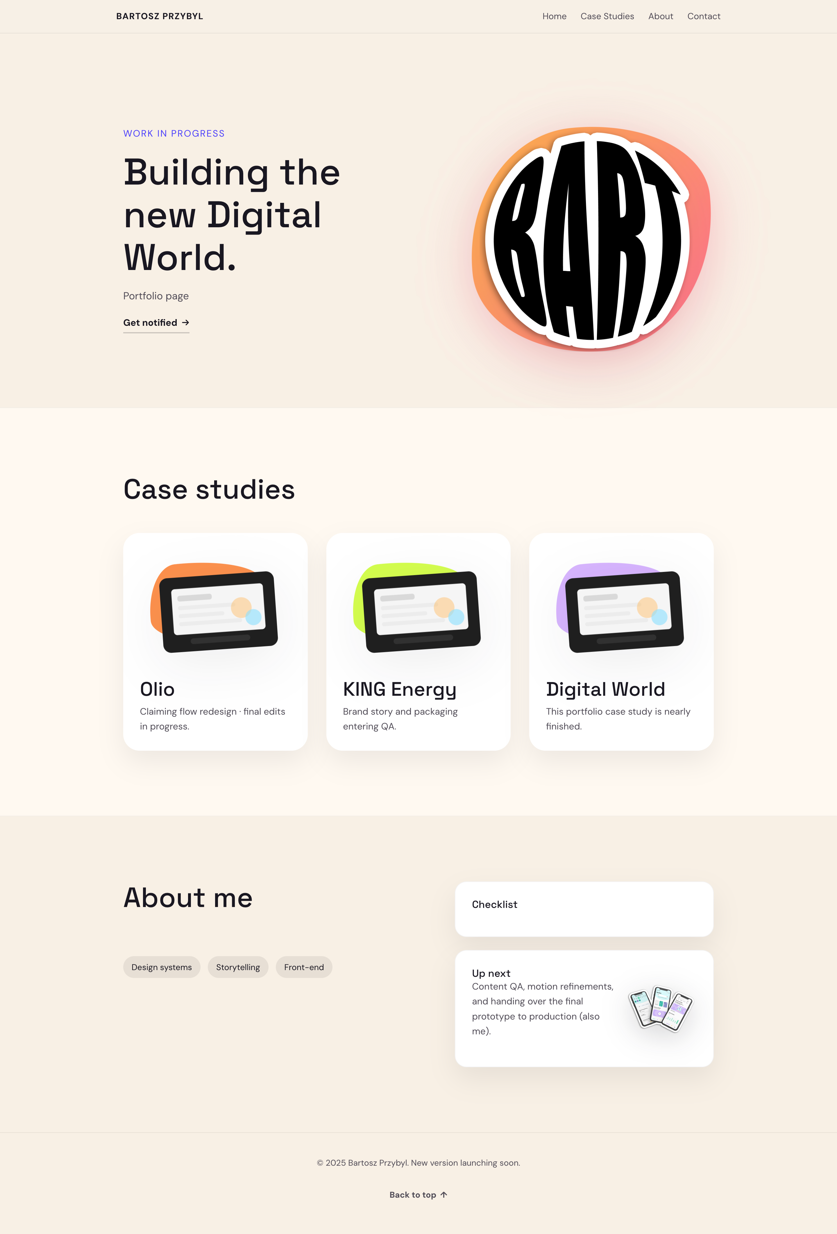
06 — Work-in-Progress Designs
Early digital designs tested multiple logo scales, mascot placement, and content density. Initial layouts were visually bold but lacked hierarchy, which was evident with placeholder images. Through iteration, I refined spacing, simplified navigation, and clarified call-to-action placement to better support recruiter scanning behaviour (Nielsen Norman Group, 2023).
 Mid-fidelity portfolio layout.
07 — Peer & Industry Feedback
Anonymised feedback from peers highlighted strong branding but identified areas where usability could improve. Comments noted that the hero section initially lacked clarity and that some case study layouts felt visually dense. Industry-focused feedback emphasised the importance of quickly communicating role, tools, and outcomes. In response, I rewrote headline copy, simplified case study headers, increased contrast, and added clearer project summaries. This feedback process reinforced the importance of designing not only for creativity, but also for recruiter efficiency and accessibility (Nielsen, 2020).
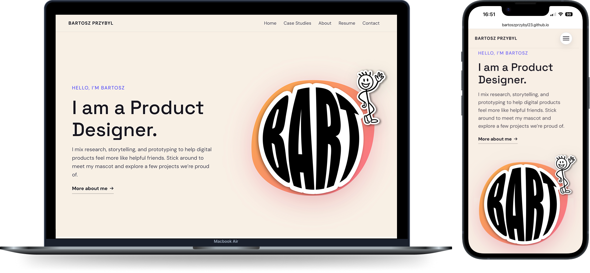
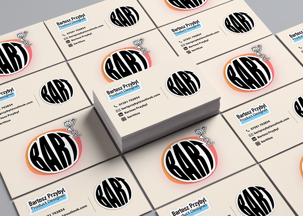
08 — Final Outcomes
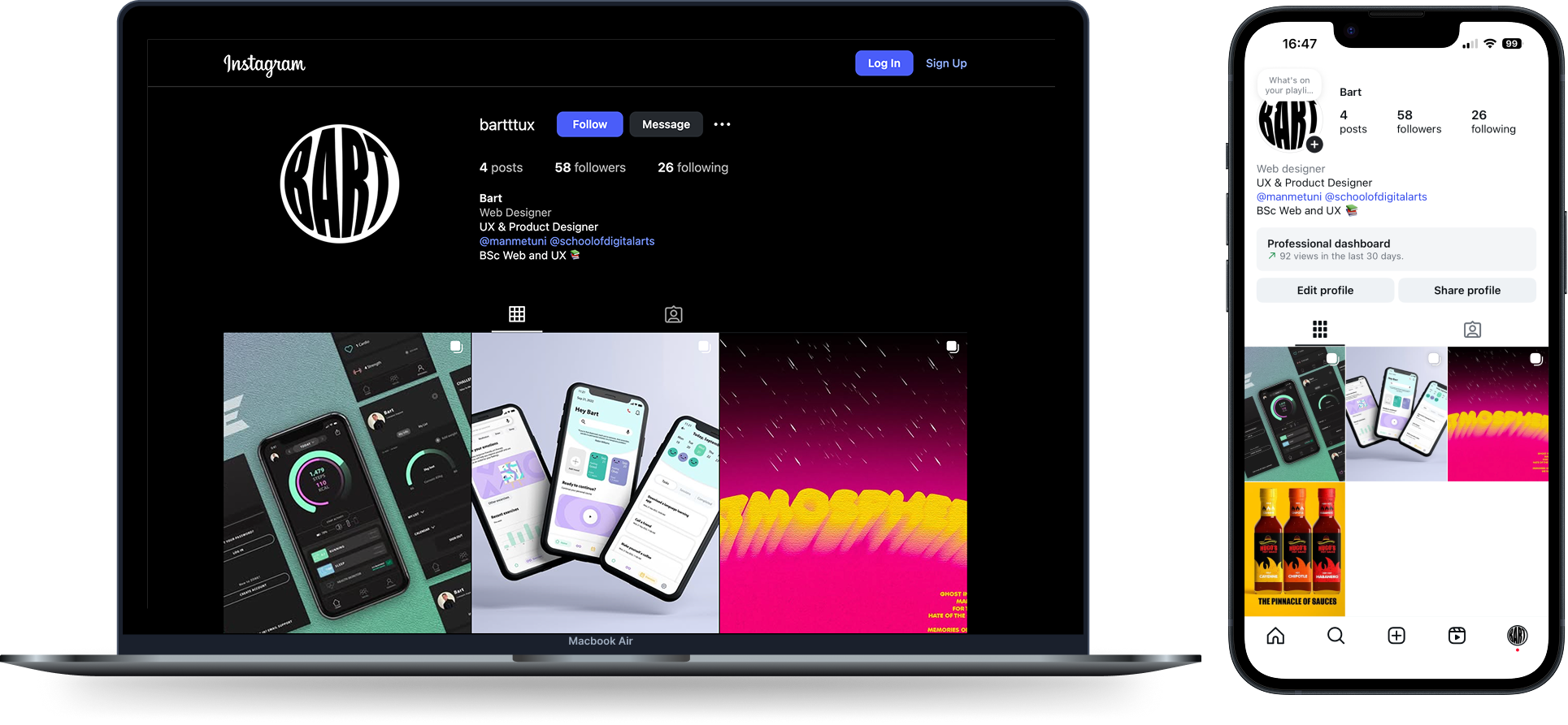
The final outcomes include a responsive portfolio website, a professional social media presence, and a branded business card system. Feedback directly influenced layout clarity, branding restraint, and accessibility improvements. The portfolio now presents a confident professional identity while retaining a distinctive, human-centred visual style.
Follow along on Instagram for the latest updates: @bartttux
References
- Bestfolios (2024) UX Portfolio Inspiration. Available at: https://www.bestfolios.com (Accessed: 2 December 2025).
- Marcotte, E. (2011) Responsive Web Design. A List Apart. Available at: alistapart.com/article/responsive-web-design (Accessed: 2 December 2025).
- Nielsen, J. (2020) How Users Read on the Web. Nielsen Norman Group. Available at: nngroup.com/articles/how-users-read-on-the-web (Accessed: 2 December 2025).
- Nielsen Norman Group (2023) UX Portfolio Case Study Guidelines. Available at: nngroup.com/articles/ux-portfolio (Accessed: 2 December 2025).
- W3C (2018) Web Content Accessibility Guidelines (WCAG) 2.1. Available at: w3.org/TR/WCAG21 (Accessed: 2 December 2025).
- W3C (2019) Responsive Design Basics. Available at: w3.org/standards/webdesign/htmlcss (Accessed: 2 December 2025).
Want the full walkthrough?
Let’s set up a session. I’ll bring the prototypes and the stickman will bring snacks.