Fragmented Information
Residents rely on multiple disconnected platforms to stay informed, including news websites, council pages and social media.
Civic Information Platform
A local information platform designed to help city residents stay informed about local changes in a clearer, more accessible and trustworthy way.
View Prototype ↗

01 — Overview
Inline is a civic information platform designed to help city residents stay informed about local changes in a clearer and more accessible way. The project began by investigating how people currently discover local information and the frustrations they experience across news websites, council platforms and social media.
Rather than starting with a fixed solution, I used research to explore issues around information overload, trust, accessibility and fragmented local information. These findings shaped Inline into a mobile-first product focused on helping residents quickly understand what is changing in their local area without relying on engagement-driven or overly complex platforms.
02 — The Problem
Staying informed about what is happening in your local area should be straightforward, but for many residents it isn't. Important updates about transport, road closures, community events and local developments are spread across news websites, council pages and social media, making information difficult to find and even harder to trust.
As local journalism increasingly moves behind paywalls and prioritises engagement, residents are often forced to piece together information from multiple disconnected sources. This creates unnecessary effort, contributes to information overload and makes it difficult to quickly understand what is changing in their community.
Residents rely on multiple disconnected platforms to stay informed, including news websites, council pages and social media.
Clickbait headlines, subscription models and inconsistent information reduce confidence in local news.
Users spend unnecessary time filtering through irrelevant content before finding the information they actually need.
Design a mobile-first civic information platform that helps residents quickly understand what is happening locally through clear, trustworthy and accessible updates, without relying on engagement-driven news feeds.
Rather than assuming what users needed, I wanted to understand how people currently discover local information, where they experience friction, and what would make the experience more trustworthy. The next stage focused on gathering evidence through user research, interviews and competitor analysis to ensure the solution was grounded in real user needs.
03 — Research
Before exploring solutions, I wanted to understand how residents currently discover local information, the frustrations they experience with existing platforms, and what would make a new solution genuinely useful. Rather than relying on assumptions, I combined multiple research methods to build an evidence-based understanding of user needs.
Understand the channels people use to access local information.
Identify where current platforms create unnecessary effort or confusion.
Explore the factors that influence confidence in local updates.
Understand behaviour, frustration and trust around local information.
Interviews, survey responses and competitor analysis.
Understanding behaviours, motivations and real user experiences.
Identifying broader behavioural patterns and recurring themes.
Evaluating existing platforms to uncover strengths, weaknesses and opportunities.
Residents rely on multiple disconnected platforms to stay informed, making it difficult to build a complete picture of what is happening locally.
Create a single platform that brings important local information together in one place.
Users were more likely to engage with information they considered reliable, relevant and clearly presented.
Prioritise trusted sources, improve information hierarchy and make important updates easy to identify.
People wanted important updates to be easy to scan rather than hidden inside long articles or cluttered interfaces.
Use concise summaries, prioritised content and mobile-first layouts that reduce cognitive load.
The research showed that improving access to local information was not simply about creating another news platform. Residents needed a service that reduced effort, increased trust and presented information in a way that was quick to understand. These findings became the foundation for the design process.
04 — Design
The research made it clear that residents didn't need another news platform—they needed a clearer way to understand what was happening around them. Rather than adding more features, I focused on reducing cognitive load, improving trust and making important local updates easier to discover. Every design decision was guided by the research findings and aimed to create a simpler, more accessible experience.
Before designing individual screens, I focused on how information should be organised. Research showed that people wanted local updates to be quick to scan, easy to trust and simple to navigate, so the structure of the product became just as important as the interface itself.
Reduce cognitive load through clear information hierarchy, concise content and intuitive navigation.
Present information in a reliable, organised and accessible way that helps users quickly identify important local updates.
Design for fast scanning behaviours and responsive interactions, recognising that most users consume local information on mobile devices.
These principles shaped both the overall structure of the platform and the way information was prioritised throughout the experience.
These principles informed the platform's information architecture, ensuring content was organised in a way that reduced complexity and helped users quickly find the updates most relevant to them.
Residents found local information fragmented and difficult to navigate.
I prioritised important updates, reduced unnecessary content and created a cleaner information hierarchy to support quick scanning and minimise cognitive load.
Users relied on multiple disconnected platforms and wanted a more straightforward way to discover local updates.
I designed a clearer navigation structure that reduced unnecessary steps and grouped related information into intuitive categories, helping users move through the product more efficiently.
Trust strongly influenced whether users engaged with local information.
I used consistent layouts, clear content organisation and accessible visual patterns to reinforce credibility and make important updates easier to understand.
These decisions reflect the UX strategy established earlier in the project and ensured that every design choice was grounded in research rather than assumptions.
Once the overall structure had been established, I developed mid-fidelity wireframes to refine layouts, navigation and content hierarchy before moving into the final interface. This allowed key interactions to be explored and adjusted while keeping the focus on usability rather than visual styling.
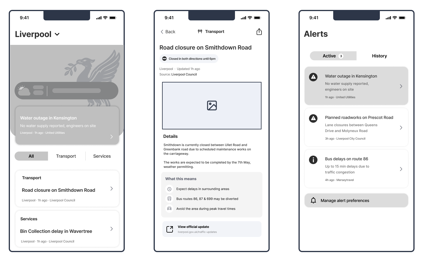 Mid-Fidelity Wireframes
05 — Testing & Iteration
With the core experience designed, I wanted to evaluate whether the interface was genuinely easy to understand and navigate. Rather than relying solely on my own assumptions, I conducted usability testing using a combination of task-based evaluation, qualitative observation and eye-tracking analysis. This allowed me to understand not only what users did, but also where they focused their attention and where friction still existed.
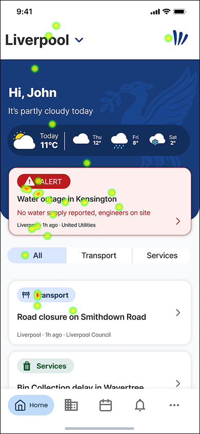
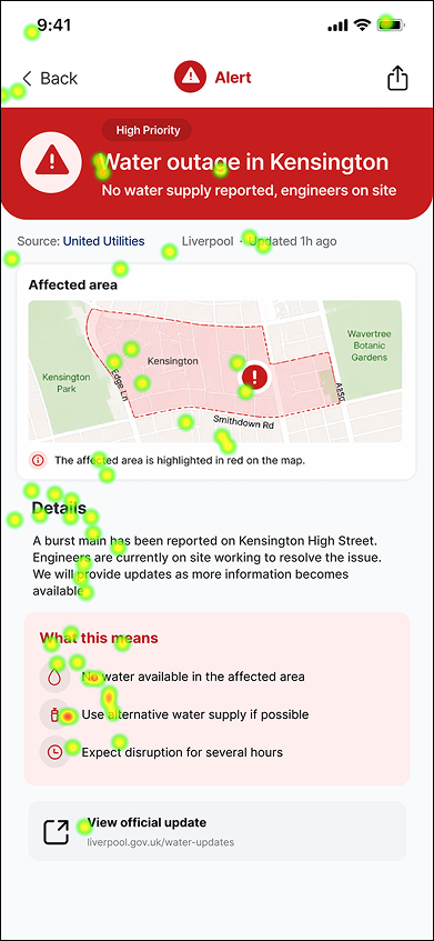
Eye tracking provided an additional layer of insight by showing where participants naturally focused their attention while completing tasks. Rather than relying only on verbal feedback, it helped validate whether important information, actions and navigation elements were being prioritised effectively.
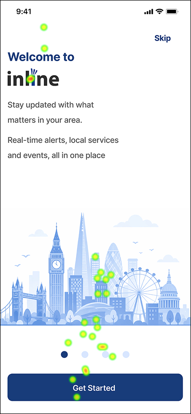
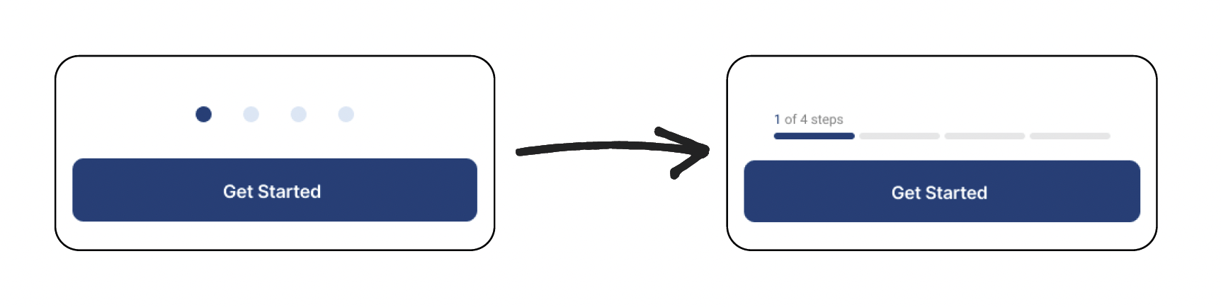
Participants interpreted the original pagination dots as swipe indicators, expecting the onboarding process to behave like a carousel.
Eye-tracking patterns and usability observations showed hesitation before progressing, suggesting uncertainty about how to move through onboarding.
The pagination dots were replaced with a segmented progress indicator and step labels, reinforcing button-led progression and making the onboarding flow easier to understand.
 Onboarding Iteration
Participants were generally able to identify important content quickly, suggesting that the hierarchy successfully directed attention towards primary updates.
Eye-tracking heatmaps showed users consistently focusing on key content areas before secondary information, helping validate the placement and prioritisation of important interface elements.
Minor spacing and visual refinements were made to further strengthen readability and scanning behaviour.
Participants were able to complete the core tasks without significant navigation issues, indicating that the overall structure of the application was intuitive.
Task-based testing demonstrated that users could successfully locate alerts, events, local updates and service information through the navigation system.
Small interaction refinements were made following testing to improve clarity while preserving the overall navigation structure.
Testing confirmed that the research-led design decisions improved clarity, navigation and information hierarchy across the experience. Combining usability testing with eye-tracking analysis provided valuable insight into both user behaviour and visual attention, allowing the interface to be refined using evidence rather than assumptions. The result was a more intuitive and accessible experience that better supports the needs identified during the research phase.
Throughout this case study I've explained the thinking behind the design decisions. If you'd like to experience the final product for yourself, you can explore the interactive prototype below.
 Open interactive prototype ↗
06 — Reflection
This project strengthened my understanding of how research can shape product decisions from the very beginning of the design process. Working through the project from problem definition to testing reinforced the importance of validating ideas through evidence rather than assumptions.
If I continued developing Inline, I would expand usability testing with a larger and more diverse group of participants to validate findings across a wider range of users. I would also explore longer-term testing to understand how people engage with the platform over time.
This project changed the way I approach UX. It reinforced that great user experiences aren't created by polished interfaces alone, but by understanding the problem first and allowing research, testing and iteration to guide every design decision.
Let’s set up a case study session. I’ll bring the prototypes and the stickman will bring snacks.