Case Study
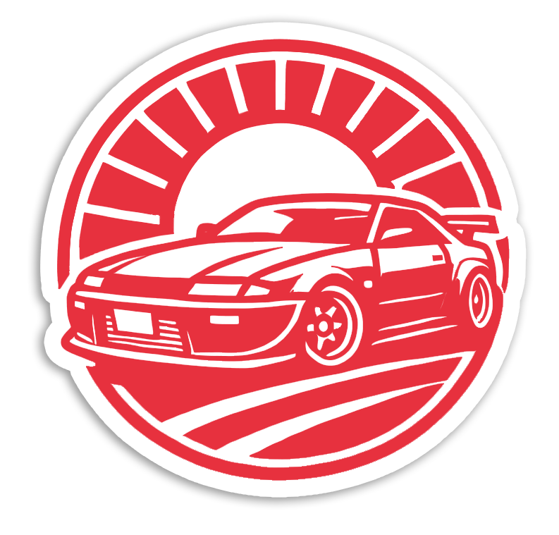
JDM Blog
A WordPress case study exploring how CMS workflows, APIs, and custom code can deliver an immersive Japanese Domestic Market experience.

01 — Overview
This project explores how a Content Management System can power a bold, content-rich website for JDM culture.
I built a WordPress website focused on JDM storytelling with custom code replication, user testing, and API experimentation. The aim was to deliver a visually striking, educational, accessible, and scalable experience across sections like History, Icons, Pop Culture, and Weekly News.
02 — The Problem
JDM culture content is scattered, inconsistent, and often overwhelming for newcomers.
- Automotive sites feel cluttered and visually noisy.
- Information is split between forums, social platforms, and video channels.
- New fans lack structured introductions to history and icons.
- Accessibility is frequently ignored.
- CMS workflows can result in inconsistent editing.
I set out to build a clean, structured site that welcomes beginners while still appealing to enthusiasts.
03 — Research & Discovery
Understanding CMS & API limits
Compared WordPress, Drupal, Joomla, Wix, and Squarespace plus YouTube, Spotify, Google Maps, and WordPress REST APIs.
- WordPress: flexible, beginner-friendly, needs maintenance.
- Drupal: secure, steeper learning curve.
- Wix/Squarespace: simple but restrictive.
- APIs enable dynamic, scalable content.
Theme selection
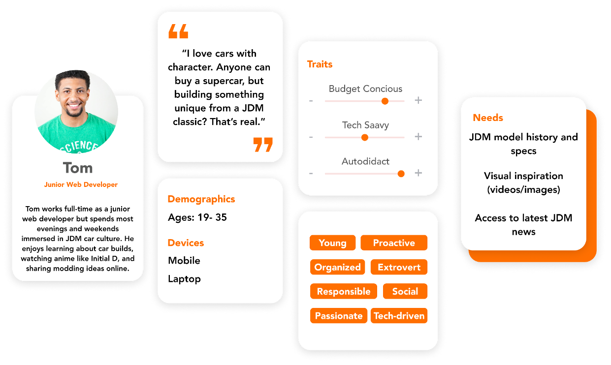
JDM culture offers a rich, visual narrative with global audience appeal. Target audience: enthusiasts aged 19–35 on TikTok, Instagram, YouTube.
Content planning
Eleven-week plan across research, content prep, UI design, coding, WordPress build, testing, and iteration. The sitemap remained simple to ensure fast navigation.
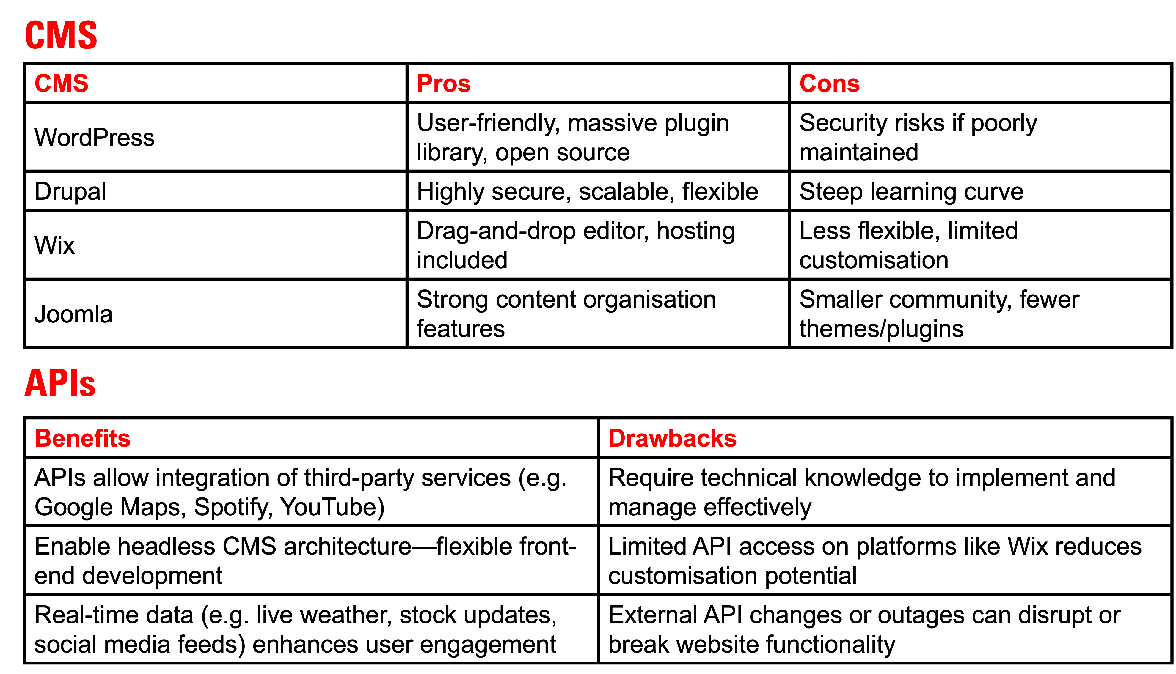 CMS & API
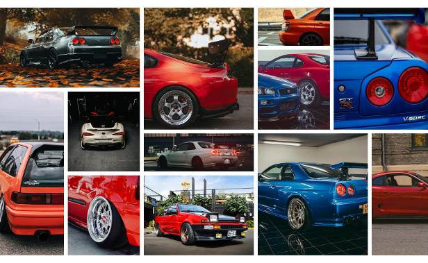
04 — Moodboard & Style Direction
Moodboard
The moodboard established the visual identity for the site.
It included:
- Red and white elements reflecting Japanese symbolism
- Glossy car photography
- Drifting smoke, asphalt textures
- Wheel spokes, headlights, badge geometry
- Typography from racing posters and car magazines
This direction guided the final palette and layout decisions.
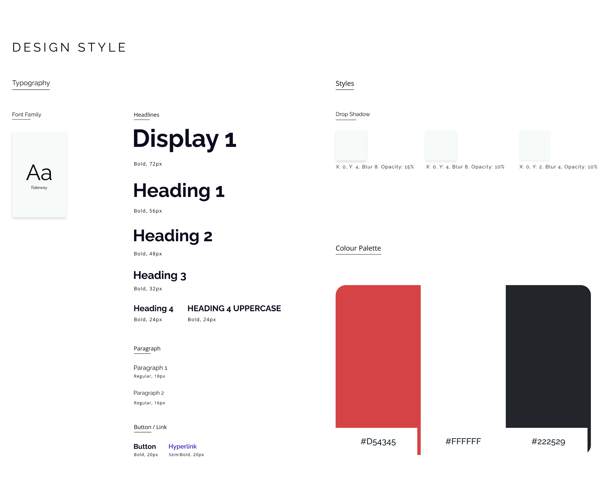
Style Guide
To create a consistent and accessible interface:
Colours
- Red (#D54345) — energy, speed, Japan
- White (#FFFFFF) — clarity, space
- Charcoal (#222529) — contrast for readability
Typography
Raleway was chosen for clean, modern readability across paragraph-heavy pages. Its geometric structure reinforces the automotive theme without distracting from content.
Accessibility
I aligned the site with WCAG 2.1 by:
- Ensuring contrast ratios
- Adding alt tags
- Using semantic HTML
- Avoiding colour-only meaning
- Checking keyboard navigation
05 — Wireframes
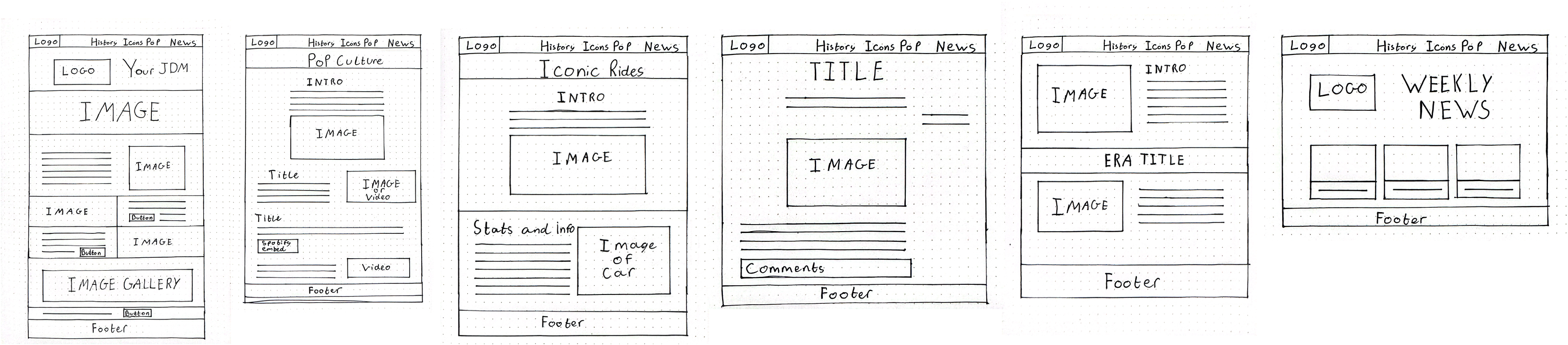
Hand-drawn and digital wireframes defined the structure for Home, History, Icons, Pop Culture, Weekly News, and blog posts.
07 — Final Website Pages
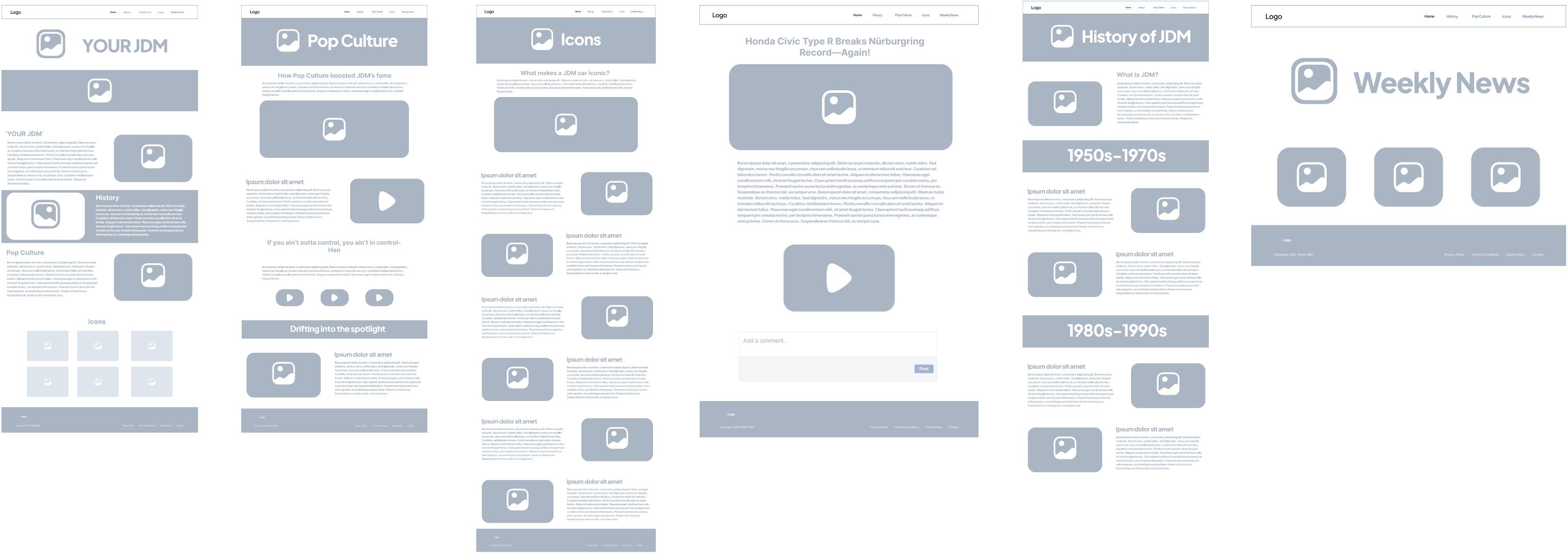
Homepage
Bold hero, history + pop culture blocks, six-car icon grid.
History Page
Timeline 1950–present with angled banners and embedded YouTube video.
Icons Page
High-res imagery, alternating layouts, performance stats, cultural context.
Pop Culture Page
YouTube API scenes, Spotify embeds, drift-styled hero.
Weekly News
Blog grid linking to individual posts.
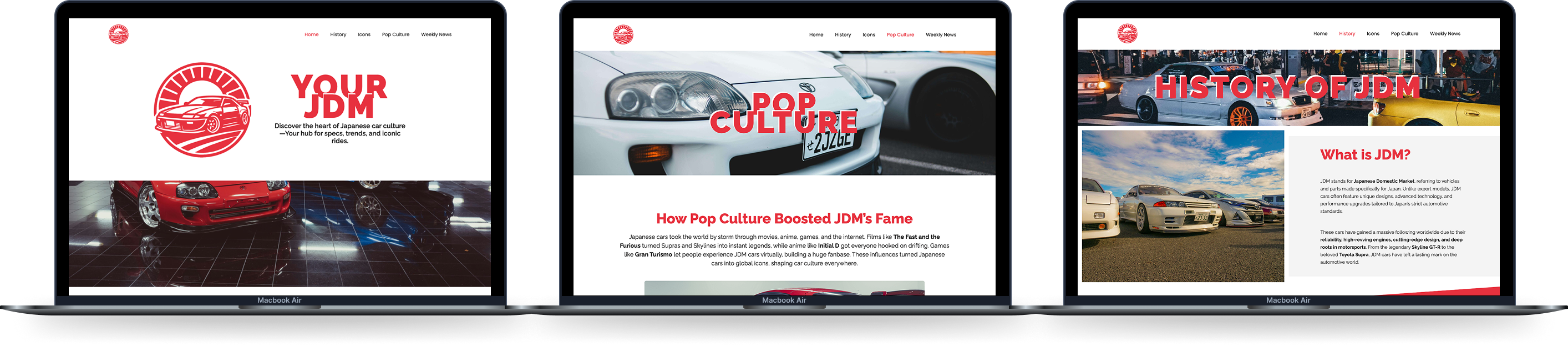 Screens showcasing key pages.
Want to explore the full WordPress build? Check out the website →
08 — User Testing
A think-aloud edit session pushed the CMS to its limits. The tester was asked to change two hero images, rewrite a headline, and update two paragraphs on the homepage and Icons page. They swapped in a surreal “monster” illustration, changed the hero copy to “I AM A MONSTER,” and dropped in placeholder-style prose. The edit was intentionally dramatic, but it revealed how easily unstructured content can break visual rhythm.
What worked
- Navigation and editor workflow remained intuitive.
- Content blocks held their responsive structure.
- Think-aloud commentary surfaced the editor’s reasoning in real time.
Issues found
- Uncompressed imagery slowed the page when large assets were uploaded.
- Extreme headline length shifted layout, highlighting the need for CMS limits.
- Paragraph rewrites showed how quickly tone can drift without guidance.
- Reinforced the value of contributor guidelines, version control, and WordPress editing constraints.
09 — Outcome
The final WordPress site presents JDM culture cleanly, integrates YouTube & Spotify APIs, supports weekly updates, and stays fully responsive and easy to maintain.
10 — Reflection
Learnings: replicating WordPress features in custom code, CSS transforms (angled banners), API embedding, maintaining layout stability, responsive testing, accessibility, and peer reviews.
Overall, the project strengthened my CMS design, coding confidence, and ability to blend visual storytelling with structured web design.
Want the full walkthrough?
Let’s set up a session. I’ll bring the prototypes and the stickman will bring snacks.