Case Study
KING Energy
A design-led energy drink identity that rejects chaotic clichés in favor of simplicity, geometry, and confident typography — spanning naming, packaging, digital, and campaign touchpoints.

01 — Overview
KING Energy explores how modern, design-led restraint can elevate an energy drink brand.
While most competitors embrace chaotic textures, neon palettes, and aggressive shapes, KING takes a deliberate approach. Simplicity, geometry, and confident typography define the brand so it feels premium, collectible, and instantly recognisable.
Over 8 weeks I built the brand ecosystem from scratch — naming, logo, flavour differentiation, packaging, digital presence, and promotional materials. The result is a cohesive brand world that communicates clarity and energy without the noise.
02 — The Concept
KING begins with a simple idea: confidence without chaos. Inspired by premium lifestyle and tech brands, the system replaces loud visuals with sharp geometry and bold, intentional layouts anchored by a crown motif.
The visual direction leans on:
- Bold diagonals referencing a crown silhouette
- Clean, modern typography
- High-contrast flavour colourways
- Simplified layouts that express strength through clarity
This creates an identity that feels collectible, premium, and unmistakably confident.
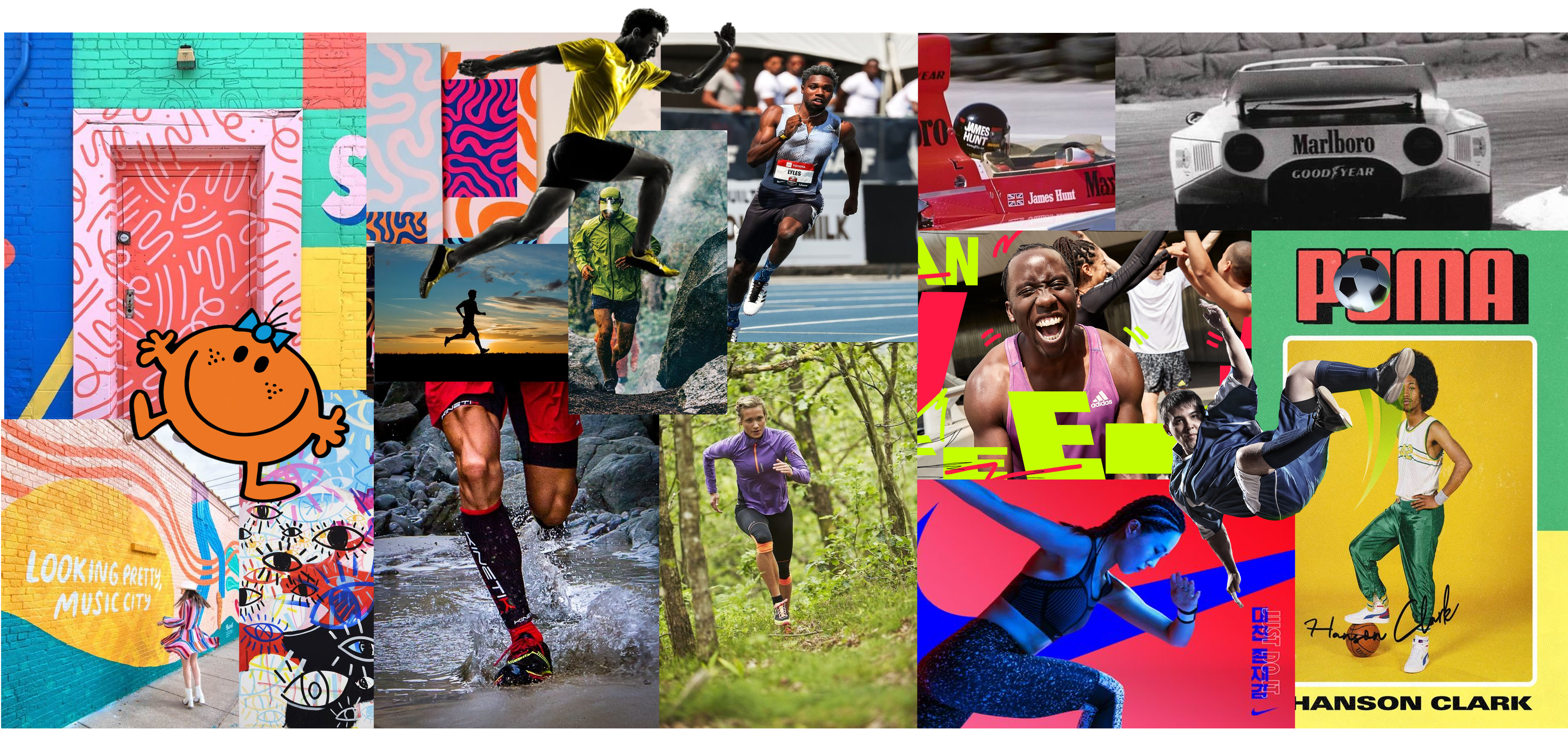
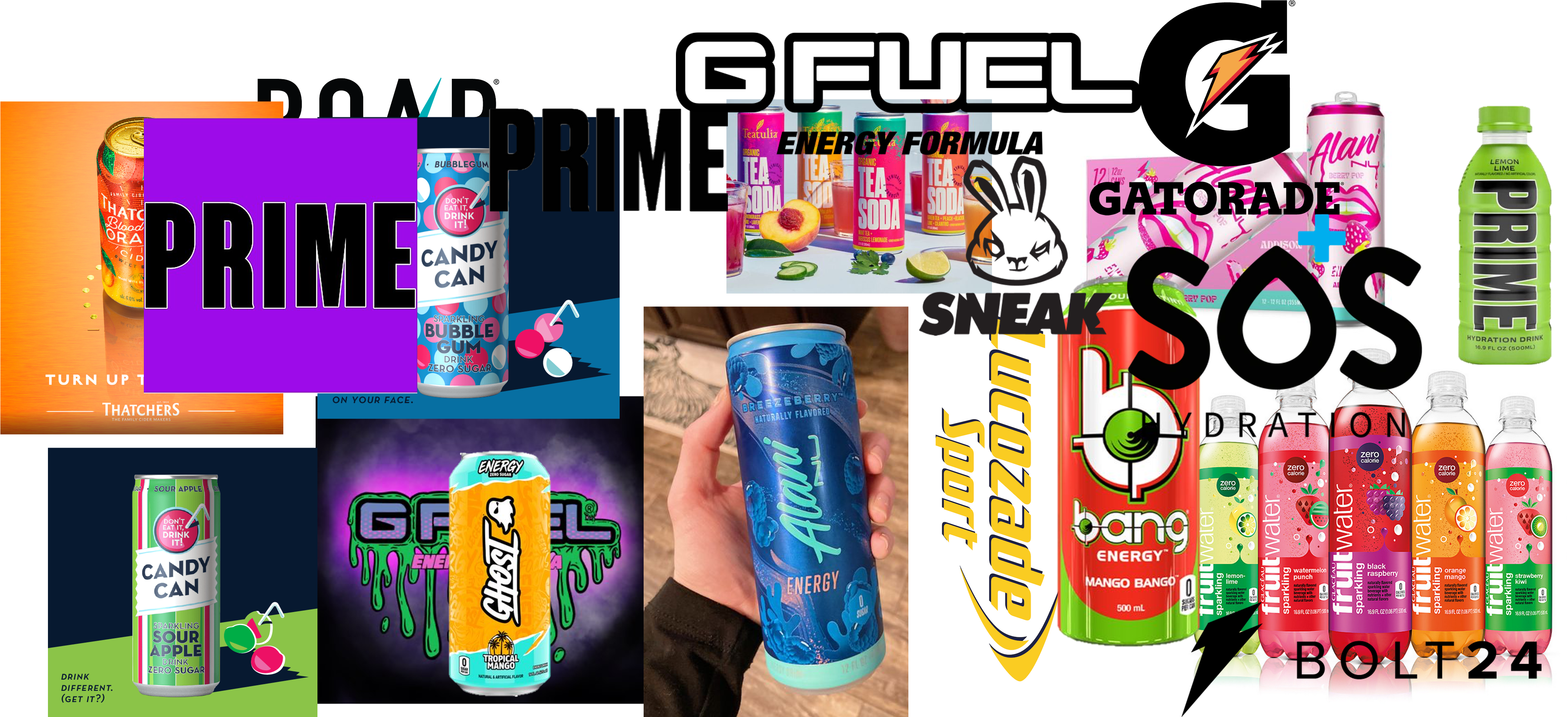
03 — Research
I compared KING against Monster, Red Bull, Prime, and Rockstar to understand where the category felt oversaturated. Instead of replicating their energy, I documented opportunities to stand apart.
Most competitors rely on:
- Harsh neon colours
- Heavy grunge or cracked textures
- Extreme-sports imagery
- Oversaturated, chaotic compositions
Audience research (ages 16–28) highlighted demand for:
- Aesthetically pleasing packaging that photographs well
- Simple, bold visuals with strong personality
- Flavour differentiation through colour and layout
- Brands that feel premium but still energetic
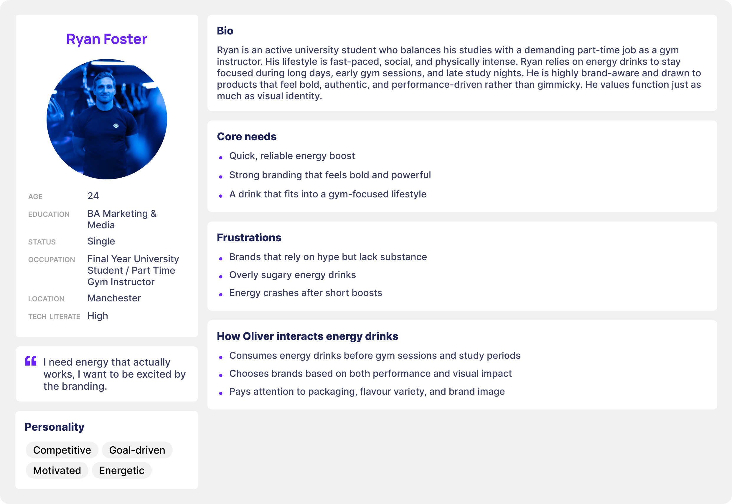 Persona
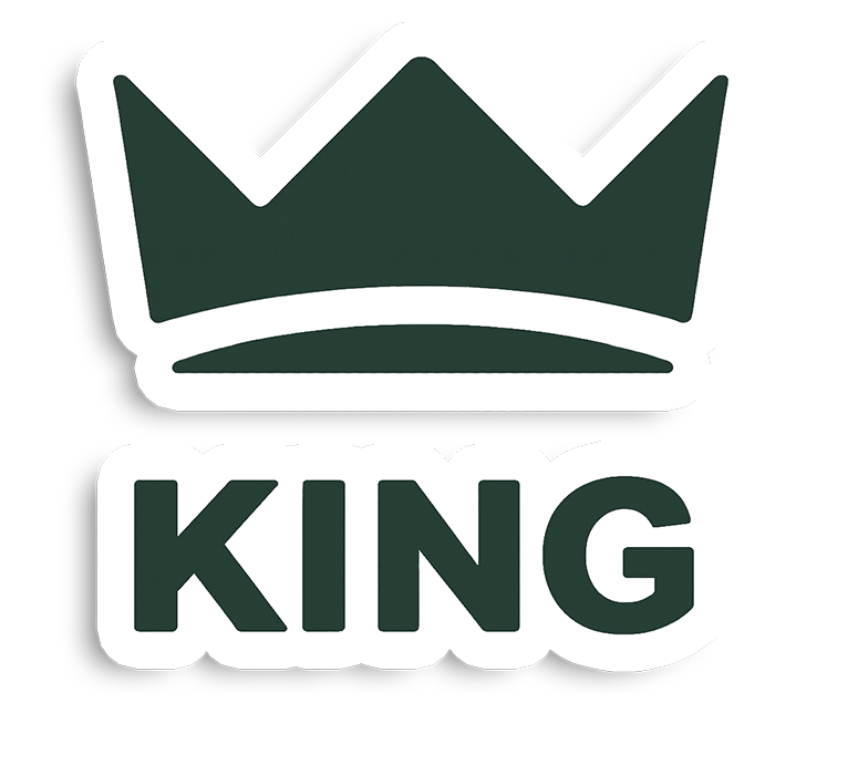
04 — Naming & Logo Development
The name “KING” establishes authority and ambition. Logo explorations focused on weaving the crown motif into the typography while keeping the mark versatile enough for packaging, merch, and digital applications.
Directions explored:
- Angular crown-inspired wordmarks
- Monoline crown icons for small-scale usage
- Extended and condensed logotypes
- Stacked arrangements for cans and posters
- Minimal symbol-only versions for flexible branding
The final mark balances simplicity with impact and scales cleanly across every touchpoint.
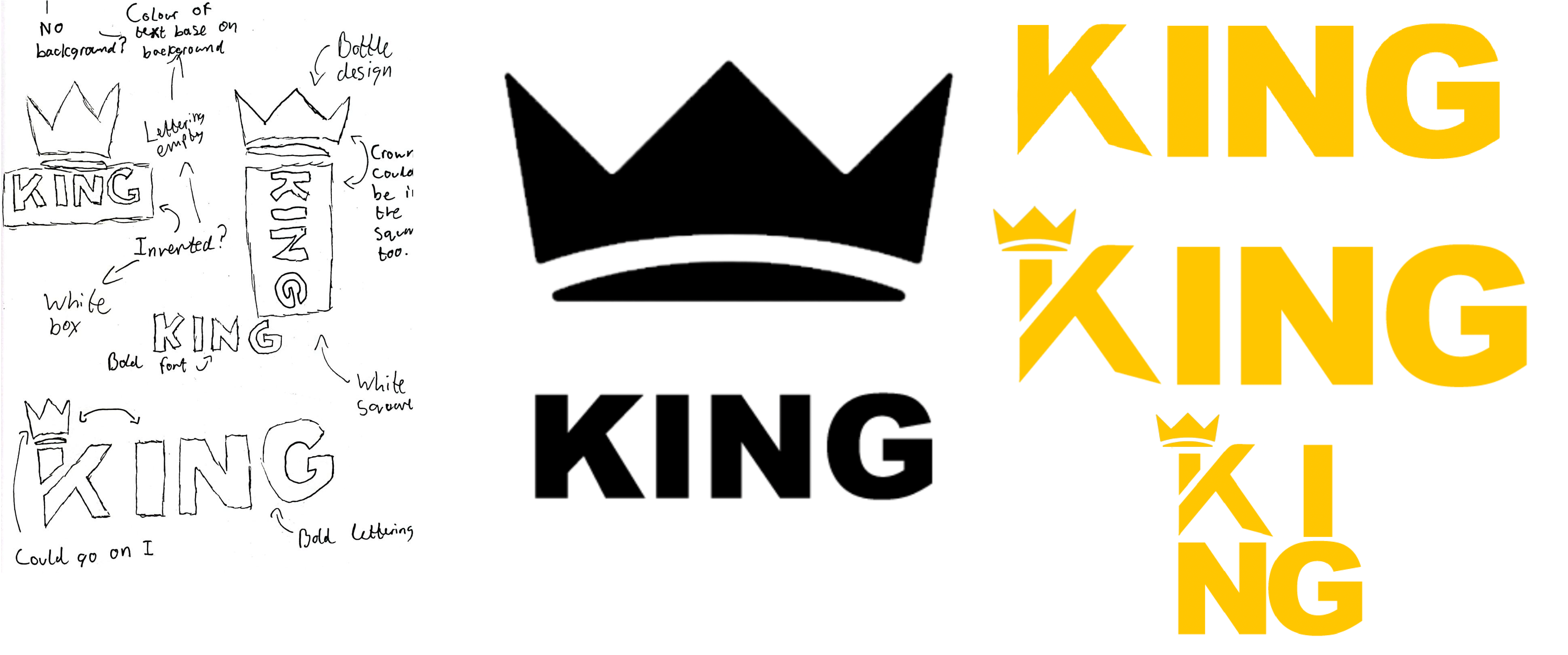 Logo sketches, type tests, and crown refinements.
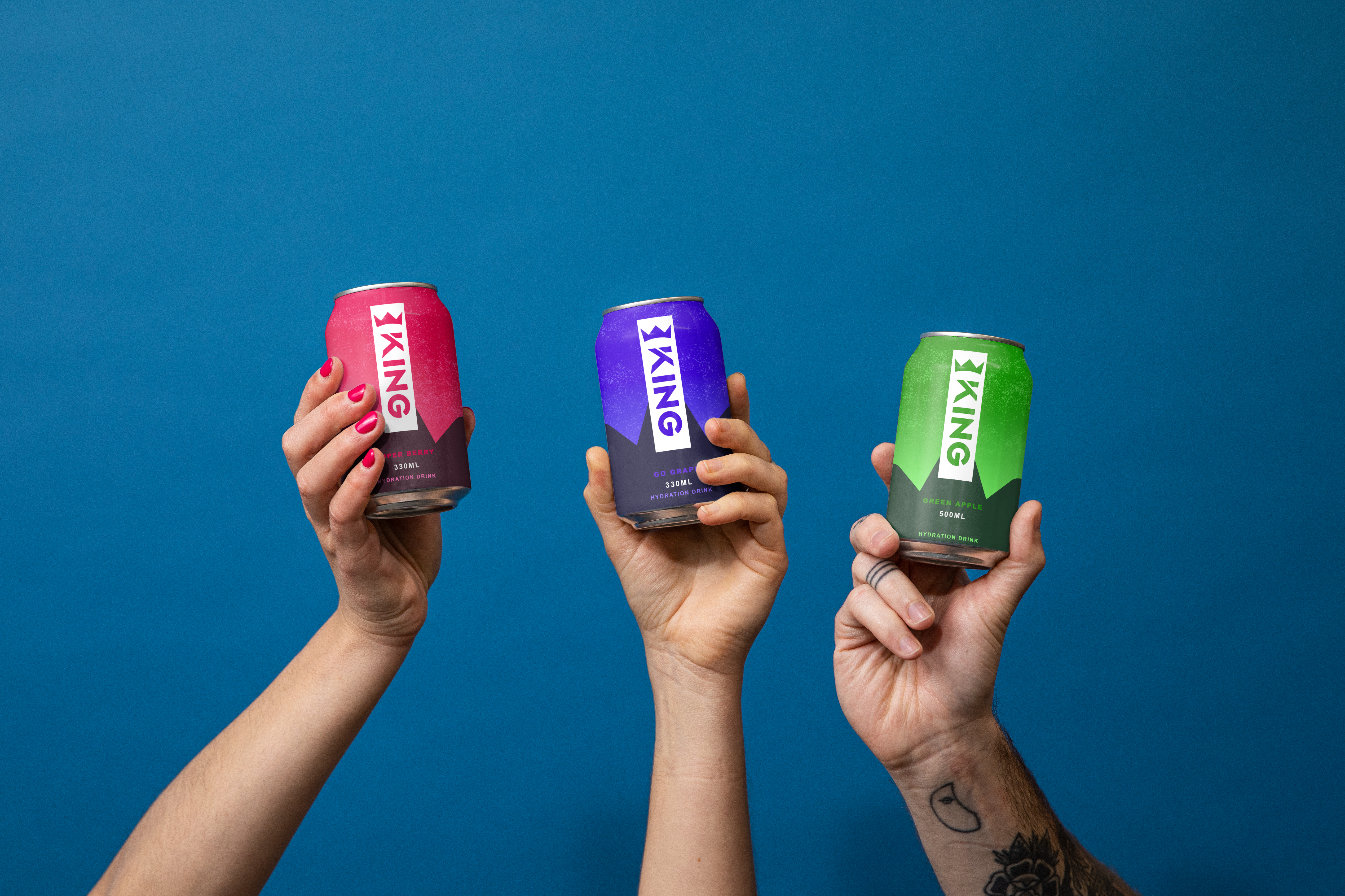
05 — Packaging Design
Packaging is the centerpiece of the KING brand. Each can uses confident diagonals, bold lettering, and colourways tied to specific flavours, resulting in a premium lifestyle object rather than a cluttered energy drink.
Packaging goals:
- Standout shelf visibility via colour and simplicity
- Strong geometric identity inspired by the crown
- Instant recognition from a distance
- Clear hierarchy between brand, flavour, and product details
- Cohesive visual system across every variant
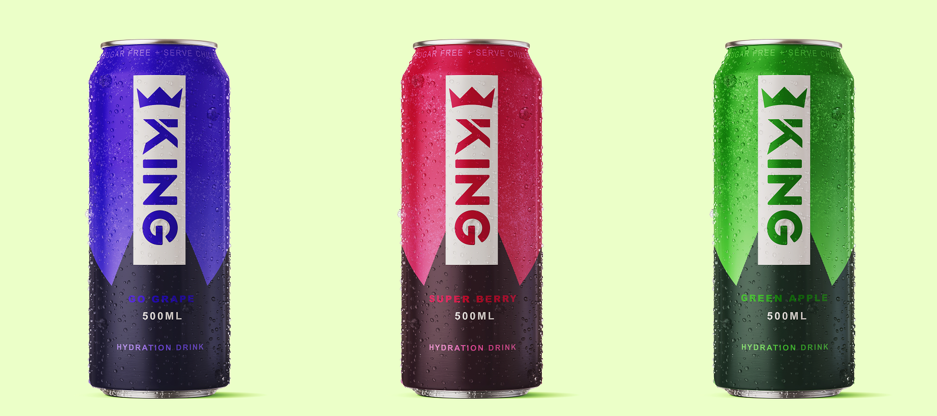 Packaging lineup showcasing flavour colourways and geometry.
06 — Website Concept
The website extends KING’s dark, dramatic aesthetic into a digital experience. Large renders, sharp type, and generous spacing create depth without overwhelming the user.
Key Features
- Hero section with full-screen product renders
- Colour-coded flavour overview tiles
- Product pages with bold typography and highlight accents
- About KING story focused on values and identity
- Mobile-first structure for responsive performance
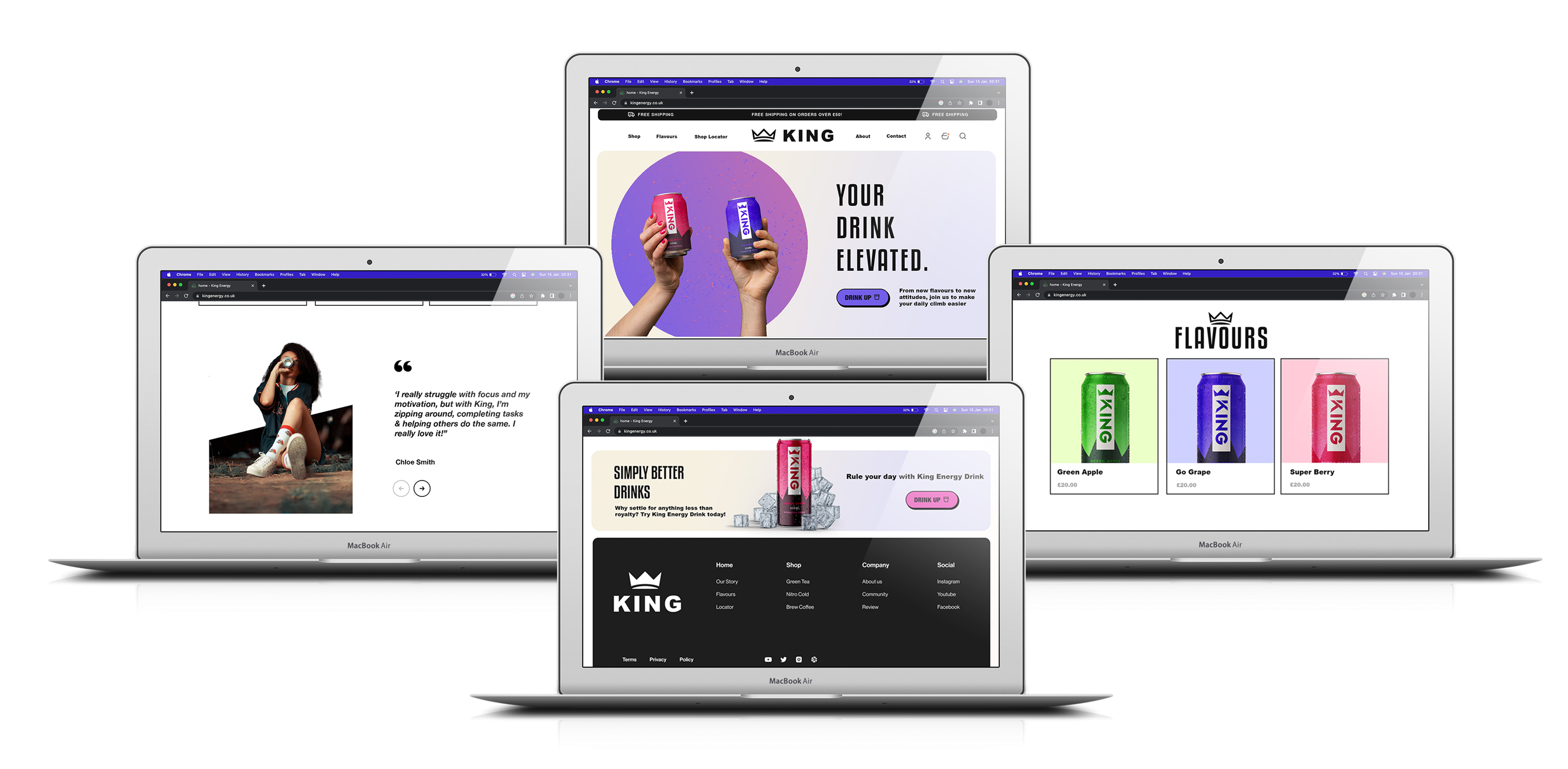 Website concept screens for desktop and mobile.
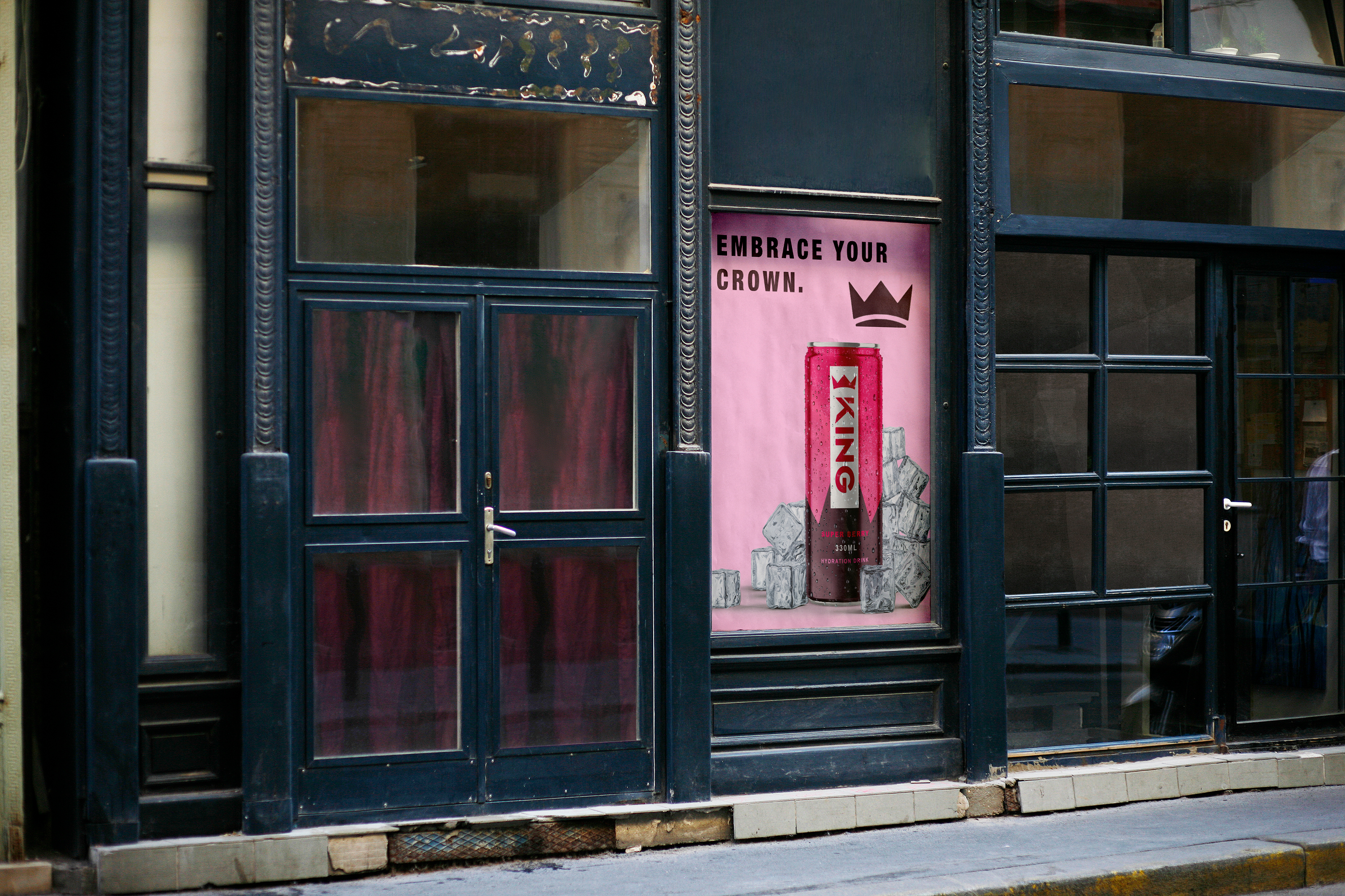
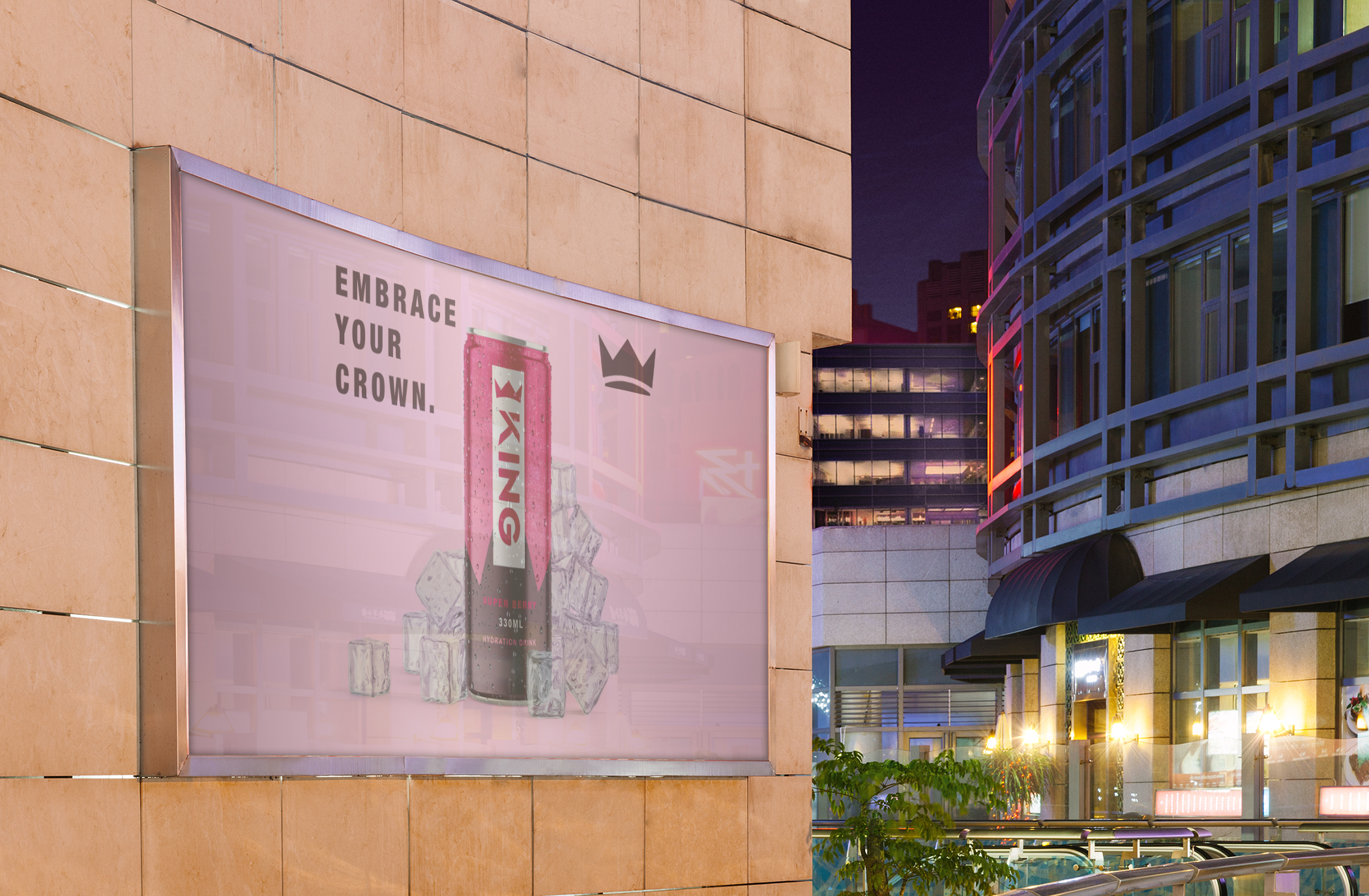
07 — Advertising Campaign
The campaign focuses on bold messaging, cinematic lighting, and composition that keeps the can as the hero object.
Campaign Principles
- Minimal text for maximum impact
- Cinematic shadows and highlights
- Repetition for hierarchy
- Attitude-driven taglines
- Focus on the can at all times
Sample Taglines
- “Rule Your Energy.”
- “Crown Yourself.”
- “Be The King Of Your Day.”
Formats covered billboards, posters, social ads, digital displays, and product highlights.
08 — Outcome
KING Energy delivers a cohesive, high-impact brand ecosystem:
- Strong conceptual foundation anchored in clarity
- Modern identity built on geometry and discipline
- Packaging lineup with recognisable silhouettes
- Website concept translating the visuals into digital
- Campaign direction communicating confidence
- Flavour differentiation via rich colour systems
09 — Reflection
KING strengthened my skills in brand creation, packaging, visual systems, and campaign development. Building a consistent identity across physical and digital touchpoints reinforced how powerful intentional simplicity can be.
Next steps could explore personalised drops, limited edition collaborations, or interactive launch events.
Want the full walkthrough?
Let’s set up a session. I’ll bring the prototypes and the stickman will bring snacks.