Case Study
Lipton Redesign
A complete UX redesign of Lipton’s global tea website, focusing on simplifying navigation, improving product categorisation, strengthening brand messaging, and creating a more modern, accessible user experience.

01 — Overview
Lipton’s digital presence needed a UX overhaul to match the strength of its global brand.
The existing site had bold branding but a weak experience. Users described the navigation as confusing, content as inconsistent, and hierarchy as unclear. They struggled to browse teas, understand sustainability messaging, or join the Tea Club with confidence.
Over 10 weeks I followed a full UX process—from research and problem framing through wireframes, design systems, high-fidelity UI, and user testing. The outcome is a completely redesigned website that emphasises clarity, structure, and modern storytelling.
02 — The Problem
Lipton is one of the most recognised tea brands in the world, but its website didn’t support users effectively. Research revealed that the experience felt outdated, visually confusing, and harder to use than competing tea brands.
- Navigation required too many steps for simple actions.
- Tea categories lacked structure, so browsing felt overwhelming.
- Key pages such as “Our Purpose” suffered from low contrast and weak hierarchy.
- Recipes were buried without labels, limiting discoverability.
- The Tea Club lacked clear benefits, incentives, or context.
- Small buttons, weak contrast, and inconsistent layouts reduced accessibility.
These issues slowed the path to purchase and reduced trust in the brand’s digital experience.
03 — Research & Discovery
Competitor Insights
Analysed Twinings, Tetley, Clipper, and Lavazza to understand how modern tea brands communicate, organise content, and guide users through purchase journeys.
- How teas were categorised and filtered
- Approaches to storytelling and sustainability messaging
- Navigation models, menus, and hierarchy
- Homepage structures & featured content strategies
- Product detail layouts & comparison tools
- Recipe discovery patterns and filters
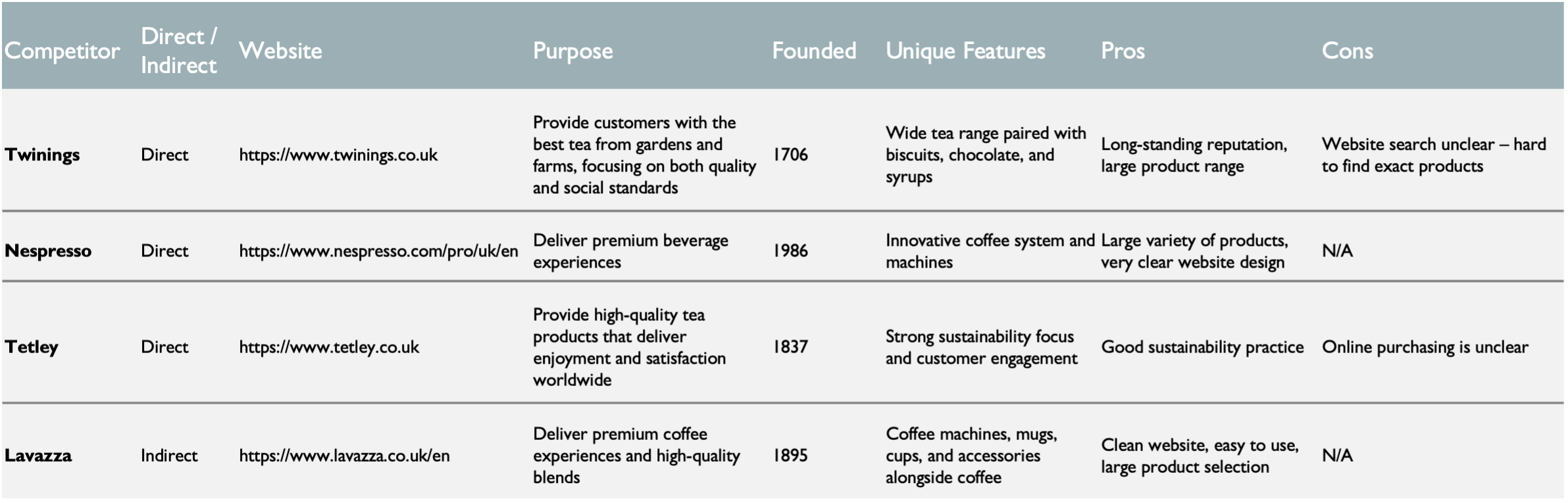 Competitor research board summarising insights.
User Interviews
Interviews highlighted friction in the ordering process and a feeling that Lipton’s site didn’t meet modern expectations for clarity or usability.
- Desire for simple, clear product categories
- Need for faster ways to find specific teas
- Request for a more meaningful Tea Club overview
- Preference for cleaner, modern layouts
- Expectation of trustworthy, transparent storytelling
Participants often ignored the “Purpose” messaging entirely because it was visually hidden or poorly structured.
Persona
A persona emerged: a daily tea drinker loyal to Lipton who wants a fast reorder path and a site that feels trustworthy and uncluttered.
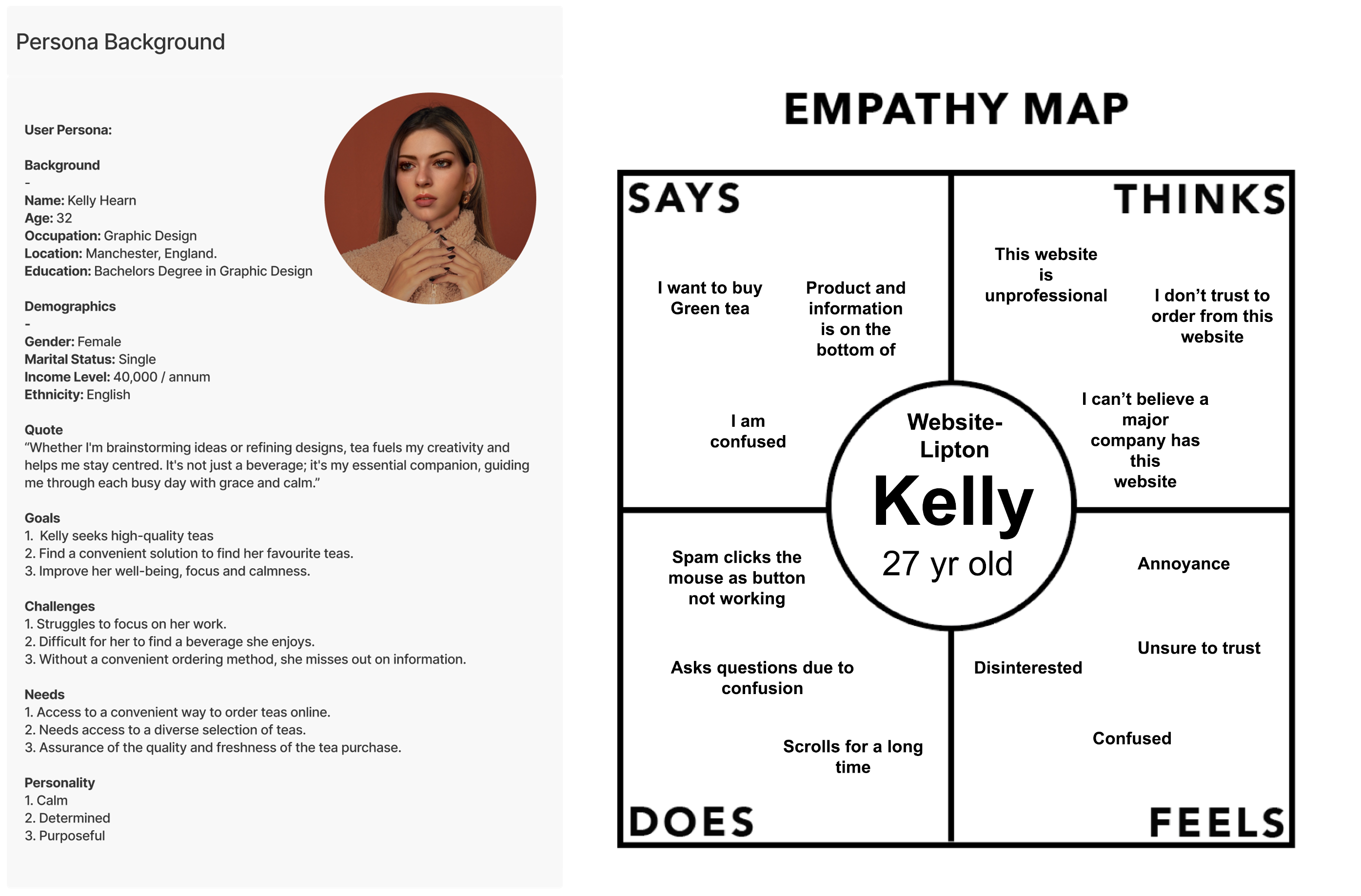 Persona overview.
04 — Defining the Problem
The core issue wasn’t the brand—it was the way information was presented and structured.
- The route to purchasing tea required unnecessary page transitions.
- Critical content blocks felt fragmented, causing confusion.
- Tea categories lacked clarity, forcing trial-and-error browsing.
- Brand values weren’t communicated despite strong sustainability work.
- Accessibility gaps (contrast, touch targets) reduced trust.
These insights framed the redesign around clarity, structure, and consistent hierarchy.
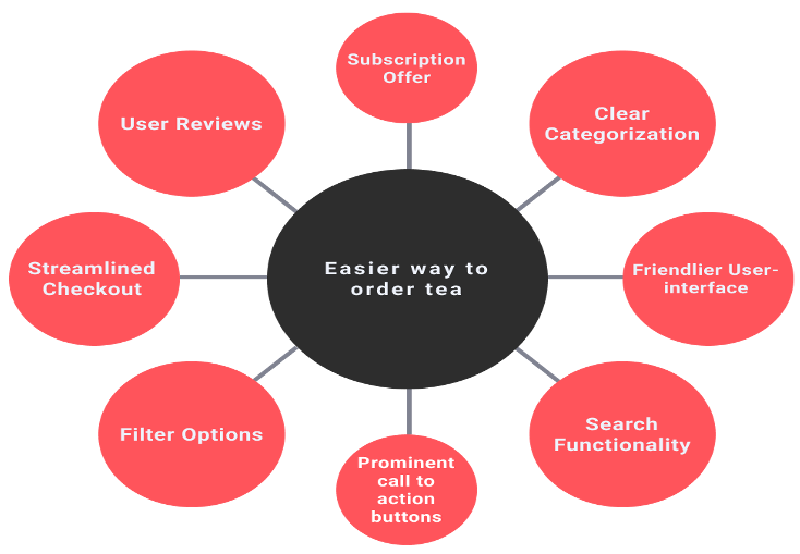
05 — Ideation & Early UX
Mind mapping explored improvements across navigation, categorisation, and content presentation while respecting Lipton’s legacy identity.
Key opportunities identified:
- Simplify checkout and reorder journeys
- Create clear tea categories with strong labels
- Improve visibility of search, filters, and recipes
- Strengthen the Tea Club message and incentives
- Introduce modern CTAs, spacing, and component rhythms
- Build a layout system that stays stable inside WordPress
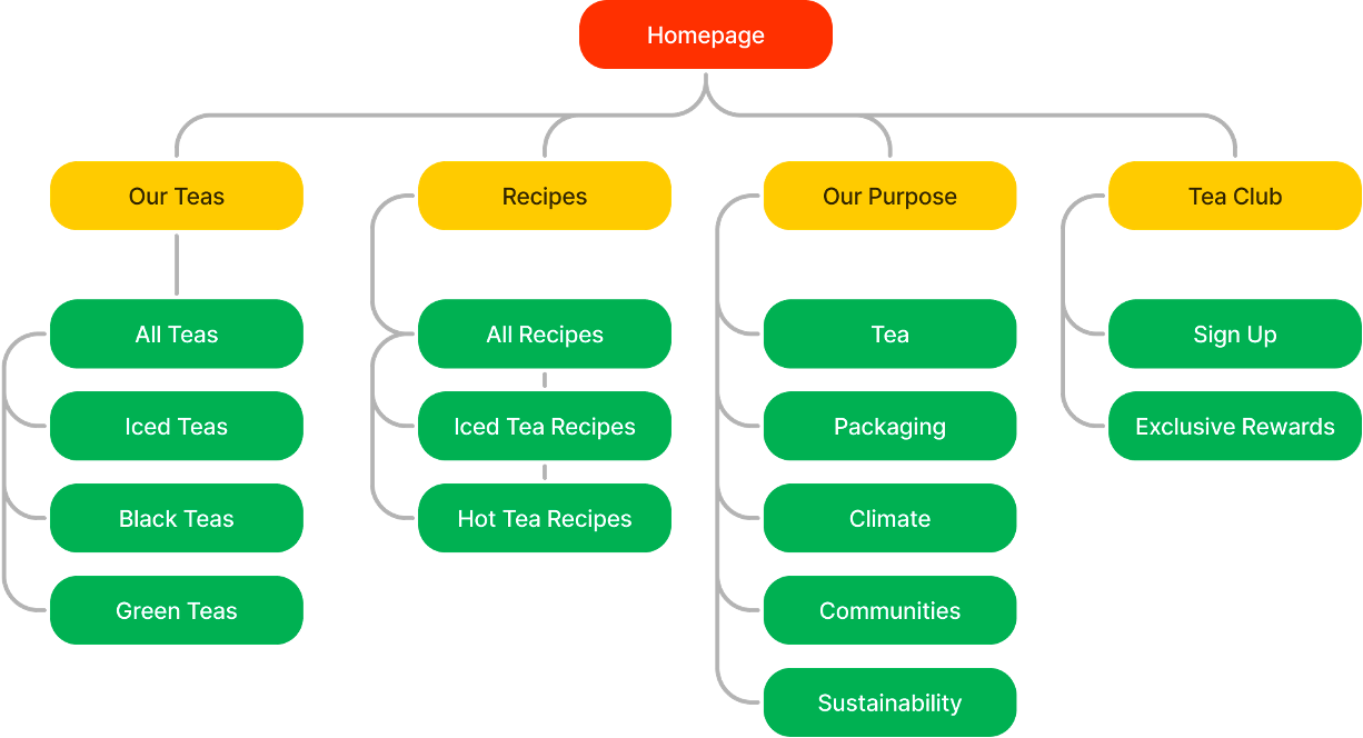
Journey mapping illustrated bottlenecks and led to a simplified sitemap with five primary pages.
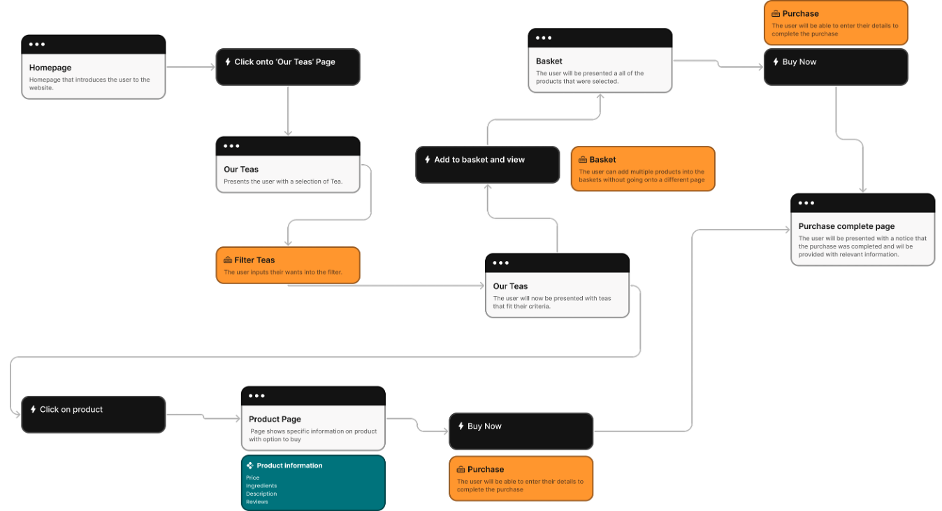
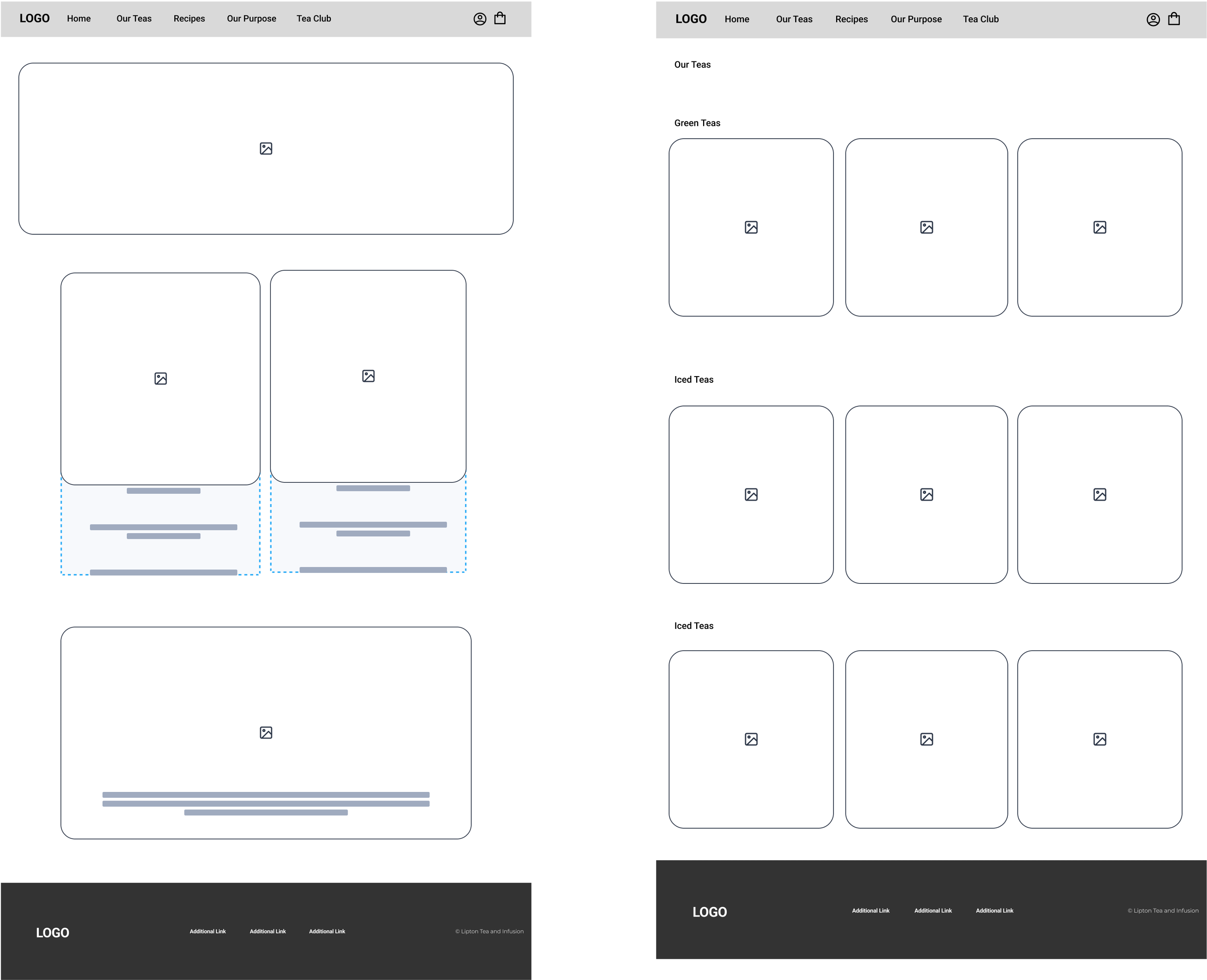
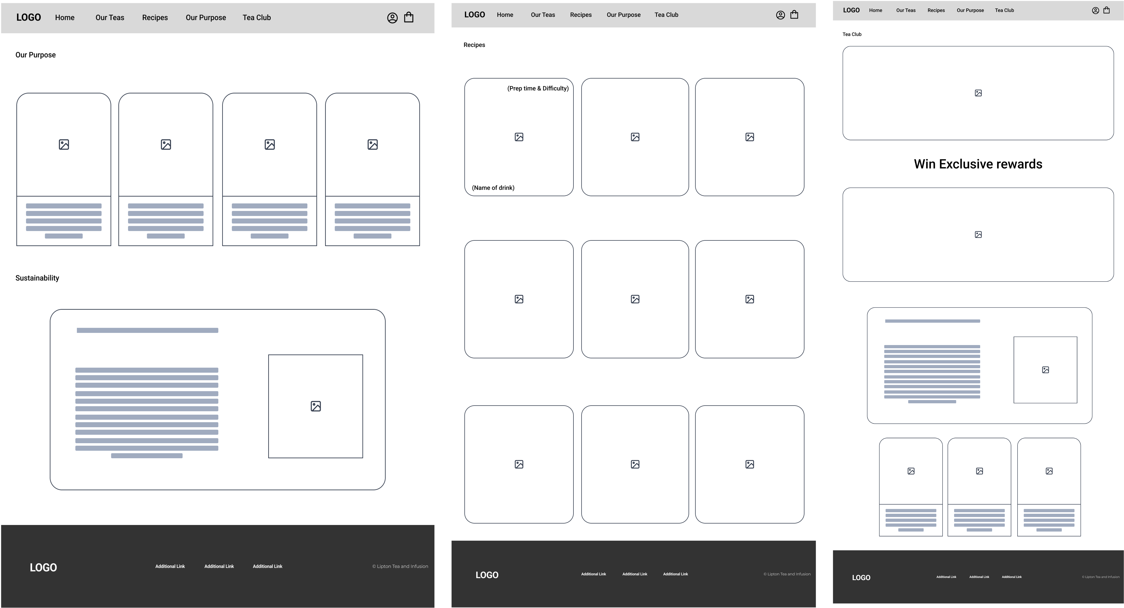
06 — Wireframes
Low-fidelity and mid-fidelity wireframes explored modular structures that would be easy to maintain in a CMS.
- Homepage structure and hero layouts
- Tea category grids that flex across devices
- Recipe filtering with obvious states
- Purpose messaging hierarchy with layered typography
- Tea Club benefit blocks with clear incentives
- Responsive behaviours and modular spacing
07 — Design System
The design system modernises Lipton’s identity with clarity, readability, and accessible interactions.
Colour Palette
A refreshed version of Lipton’s palette: Lipton Yellow, Lipton Green, Pure White, and Deep Neutral Grey.
Typography
Roboto delivers readable, versatile typography across both desktop and mobile surfaces.
Component System
Accessible CTAs, card systems, structured grids, consistent spacing, and high-contrast sections ensure CMS stability.
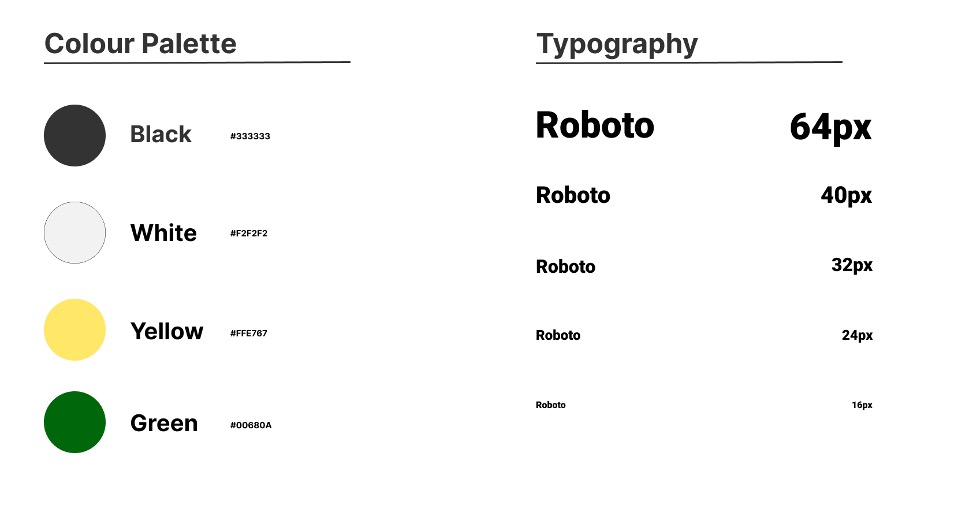 Colour, typography, and component references.
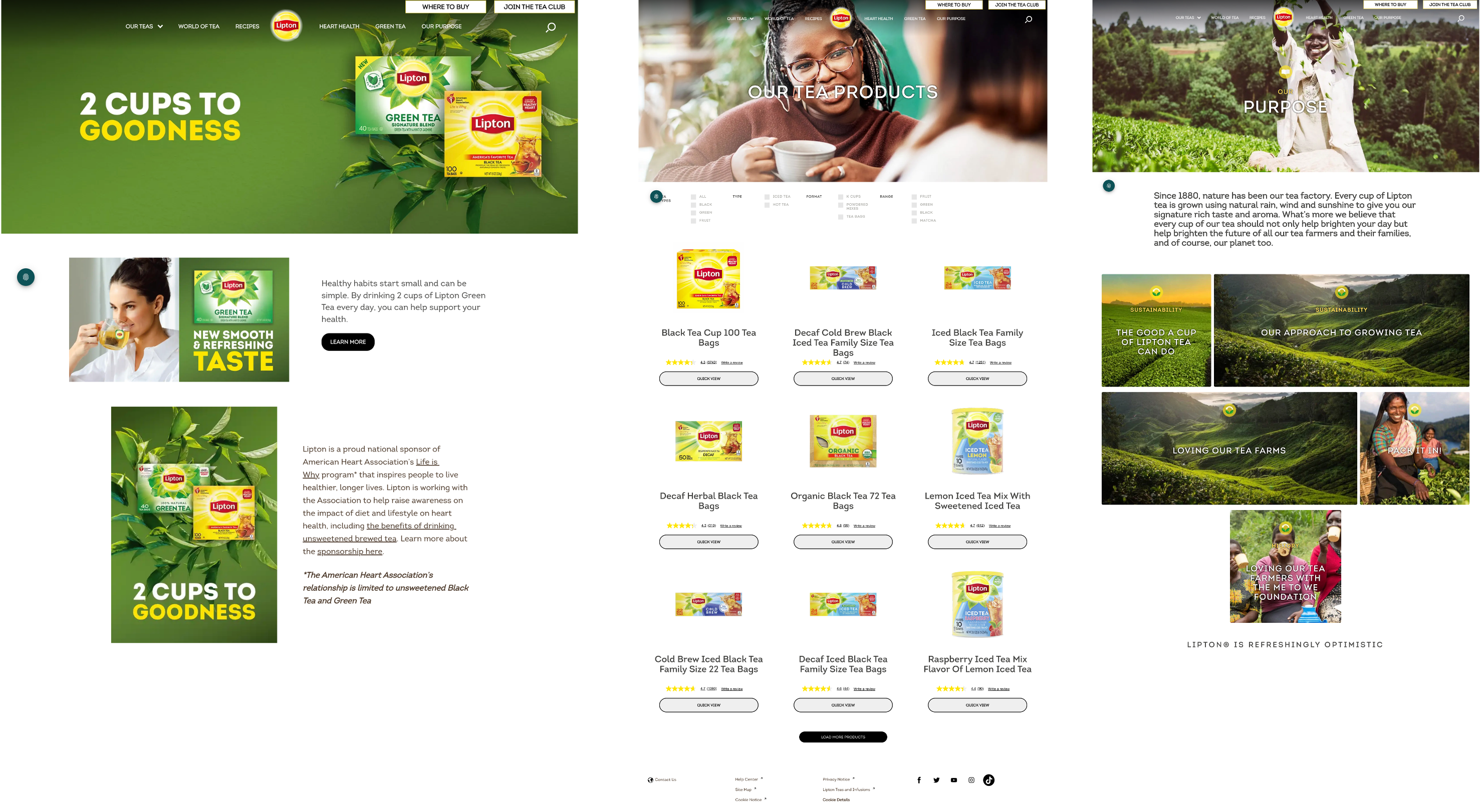
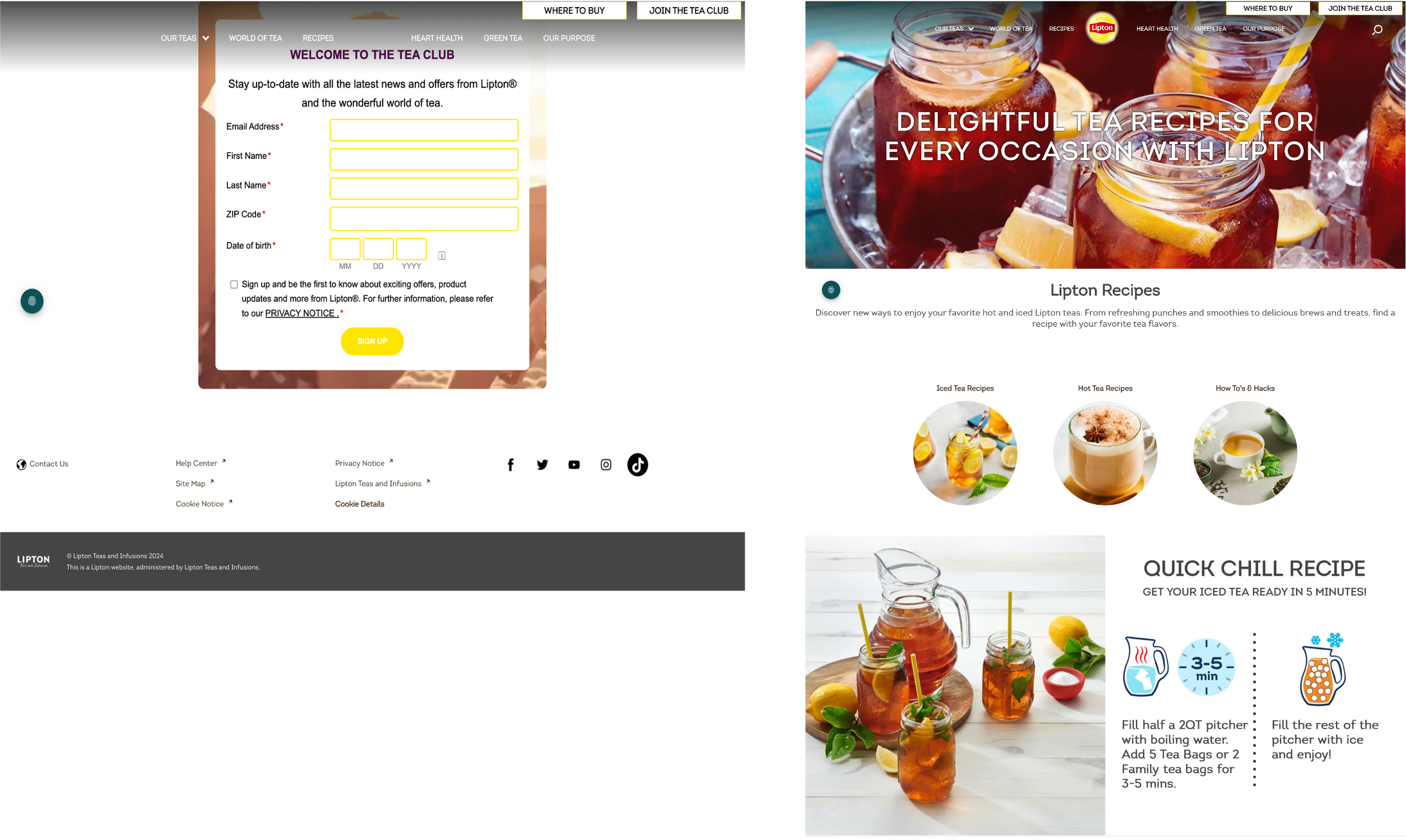
08 — Final Visual Design
The final UI introduces Lipton’s story with a bold hero, clear navigation, spotlighted teas, sustainability content, and structured recipe modules.
Want to explore every screen? View the prototype on Figma →
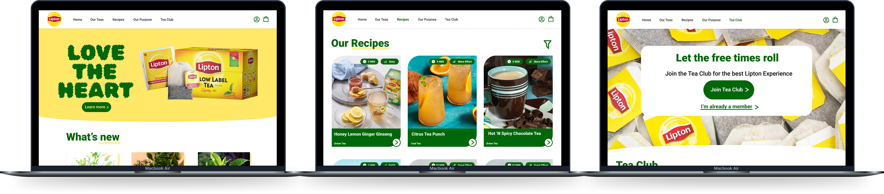 Hero, tea categories, purpose story, recipes, and Tea Club captured in one collage.
09 — Outcome
The redesign transforms Lipton’s online presence into a modern, structured, and engaging user experience.
- Navigation is cleaner and more intuitive.
- Tea categories and recipes are easier to browse.
- Brand storytelling now feels cohesive and trustworthy.
- Accessibility improvements increase user confidence.
- The Tea Club finally communicates clear value.
- The entire experience aligns with Lipton’s values.
10 — Reflection
This project strengthened my research, wireframing, information architecture, and systems thinking skills.
I learned how to redesign a large commercial brand while respecting its established identity and improving the UX through clarity, hierarchy, and accessibility.
Future improvements could explore personalised recommendations, user accounts, and interactive Tea Club features.
Want the full walkthrough?
Let’s set up a session. I’ll bring the prototypes and the stickman will bring snacks.