Case Study
NHS Booking App
UX challenge for Triad focused on a single NHS booking experience that unifies GP and hospital appointments, referrals, and follow-up care in one trusted place.


01 — Overview
NHS Booking App — UX Design Challenge (Triad)
UX design challenge set by Triad exploring a unified NHS booking experience. The brief: design a single, streamlined system that connects GP and hospital appointments in one place and reduces uncertainty for patients.
The work combined discovery, journey mapping, wireframes, and a high-fidelity prototype that keeps patients informed and reassured at every step. View the prototype: Figma prototype →
02 — The Problem & Main Opportunities
The NHS currently relies on disconnected booking systems across GP and hospital services. They do not communicate effectively, creating long waiting lists, lost referrals, and missed or delayed care—adding strain for both patients and staff.
Patients often have little visibility after a referral is made, leading to frustration, uncertainty, and reduced trust.
Main opportunity: design a single, streamlined booking system that connects GP and hospital appointments in one place.
Supporting opportunities:
- Unified booking for all appointments
- Clear referral tracking with visible timelines
- Easy rescheduling without phone queues
- Built-in accessibility support (interpreters, mobility needs)
- Reminders and notifications to reduce missed appointments
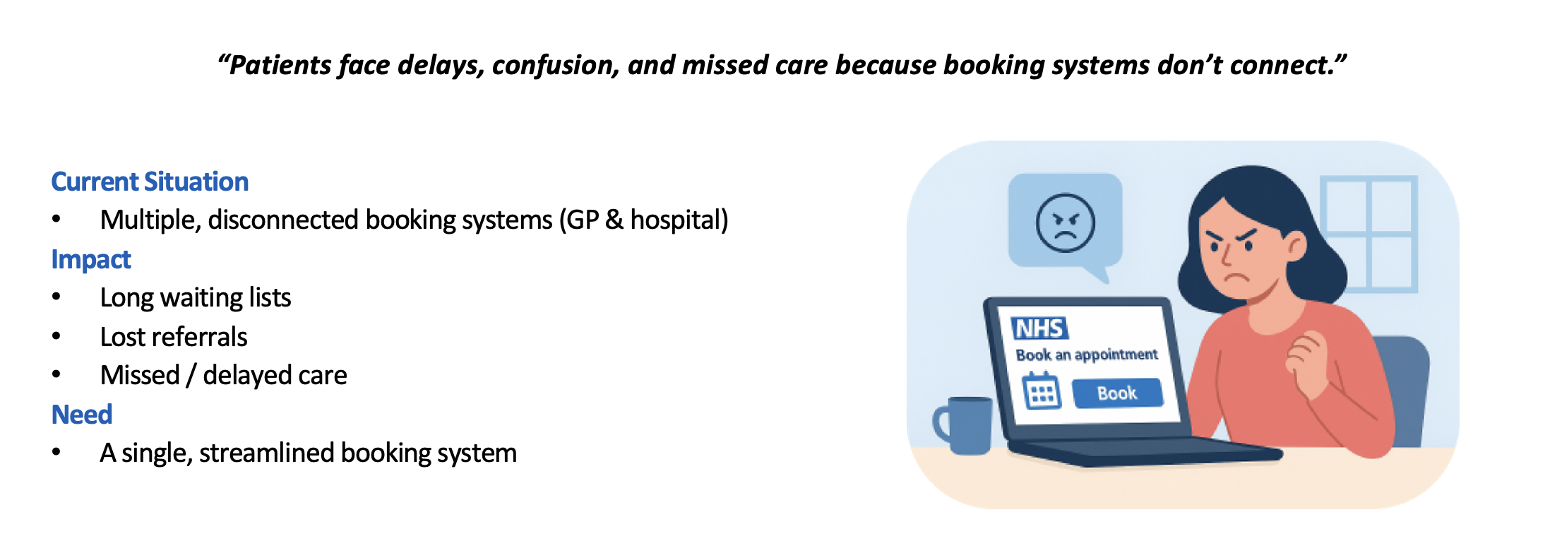 Problem and opportunity framing.
03 — Personas & Shared Challenges
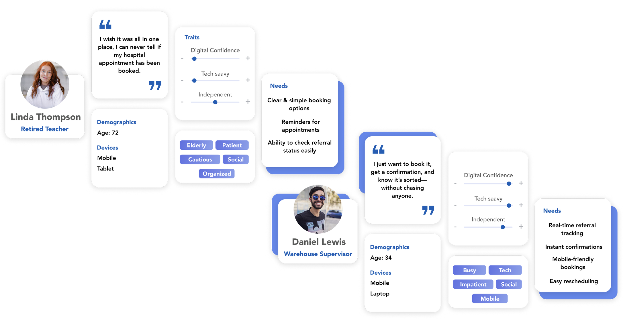
Rather than individual personas, the focus was on shared challenges experienced by patients across age groups and abilities.
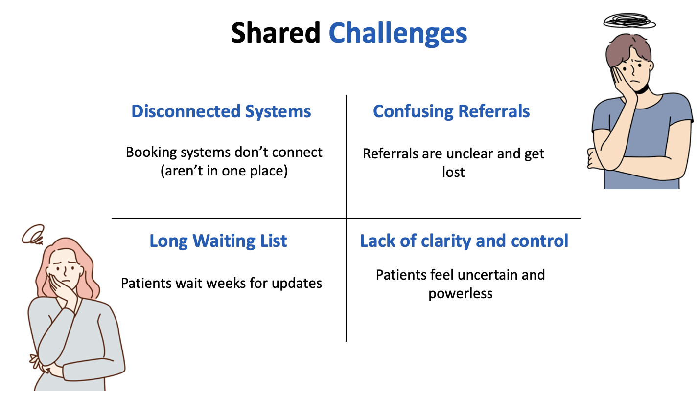
Key shared challenges:
- Disconnected systems that aren’t in one place
- Confusing referrals that feel “lost”
- Long waiting periods with no updates
- Lack of clarity and control over care
These pain points informed a design centred on reassurance, transparency, and patient control.
04 — Journey Map & Key Insights
Mapping the current booking journey showed friction at nearly every stage: delays, unclear communication, and little feedback after referrals are sent.
Key insights:
- Patients feel uncertain when there is no visible progress
- Lack of feedback increases anxiety and missed care
- Small clarity improvements can significantly reduce frustration
- A visible journey builds trust and confidence
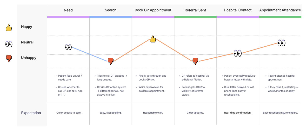 Journey map showing friction and feedback gaps.
05 — Colour Choices & Typography
Visual choices follow NHS identity standards to maintain trust and familiarity.
Colour choices
- 87% of people spontaneously associate blue and white with the NHS
- Consistent NHS blue and white to reinforce trust and recognition
Typography
- NHS permits Frutiger (print/signage) and Arial (digital)
- Arial selected as the approved digital typeface; Frutiger not available in Figma
- Type choices keep the interface official, credible, and accessible
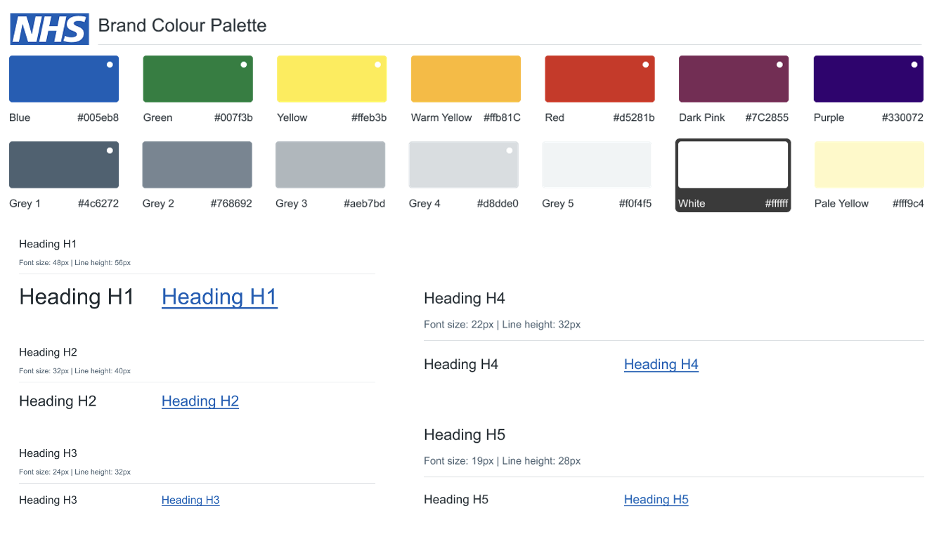 NHS-aligned colour and typography reference.
07 — Prototype & Link
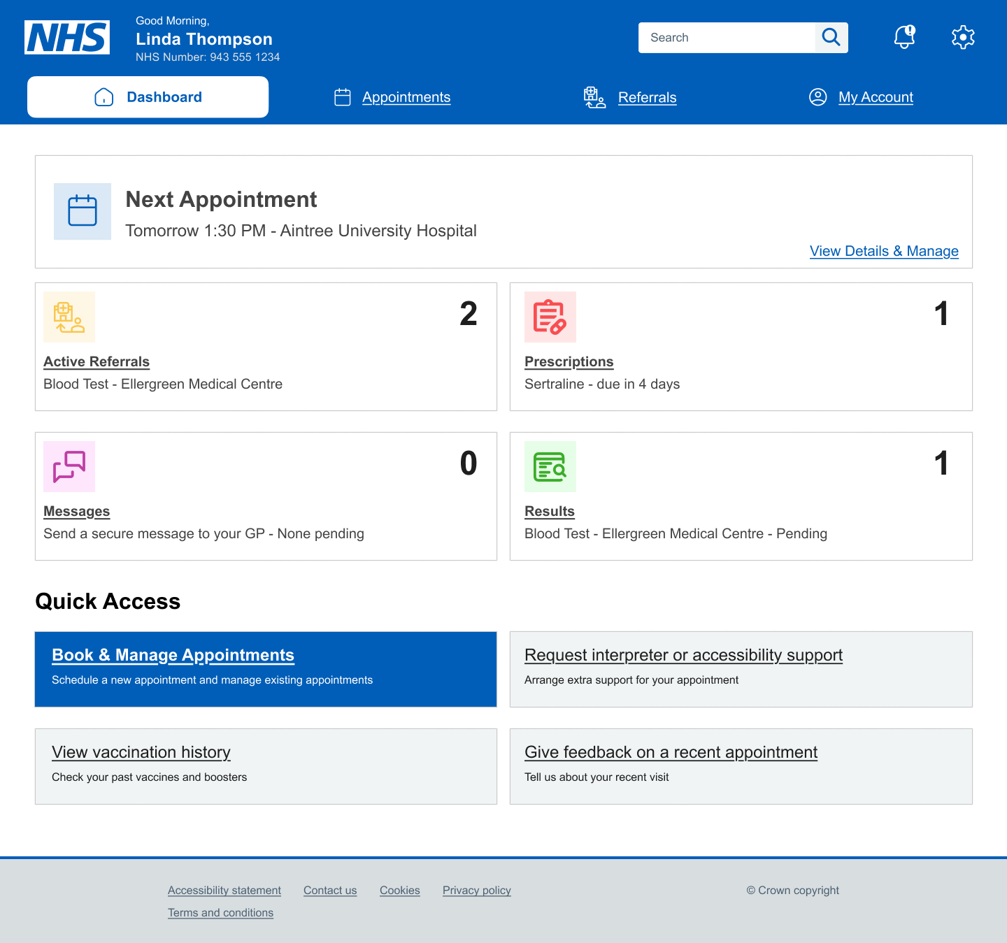
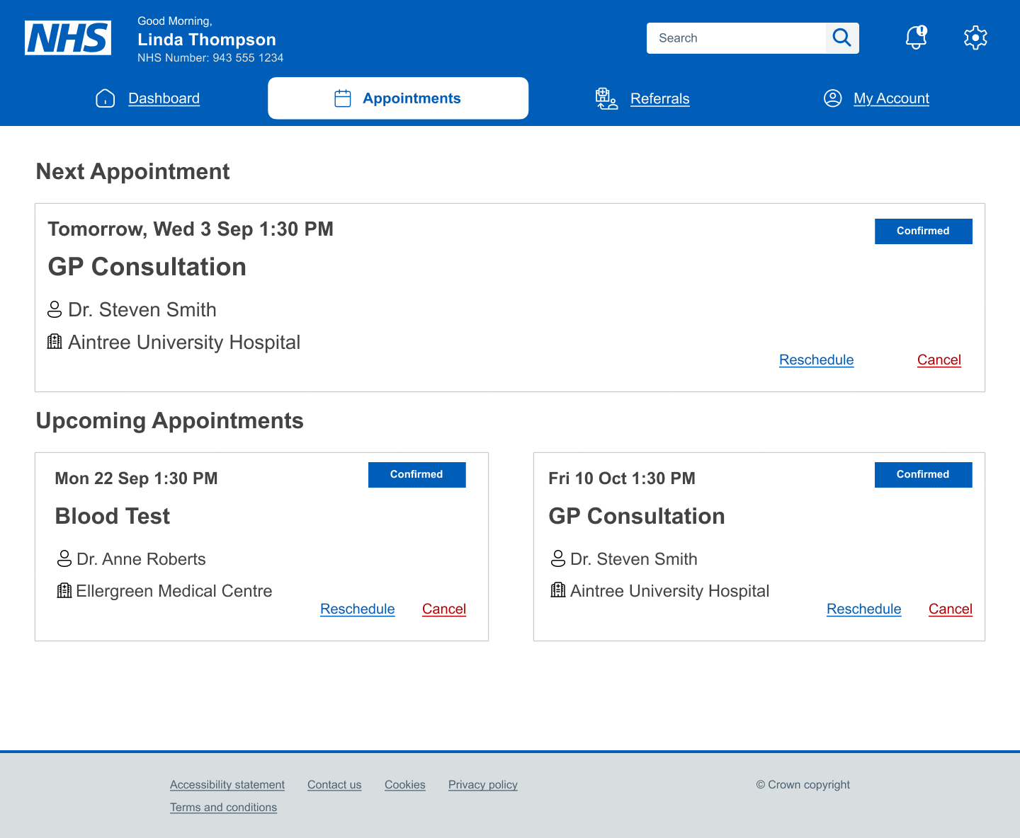
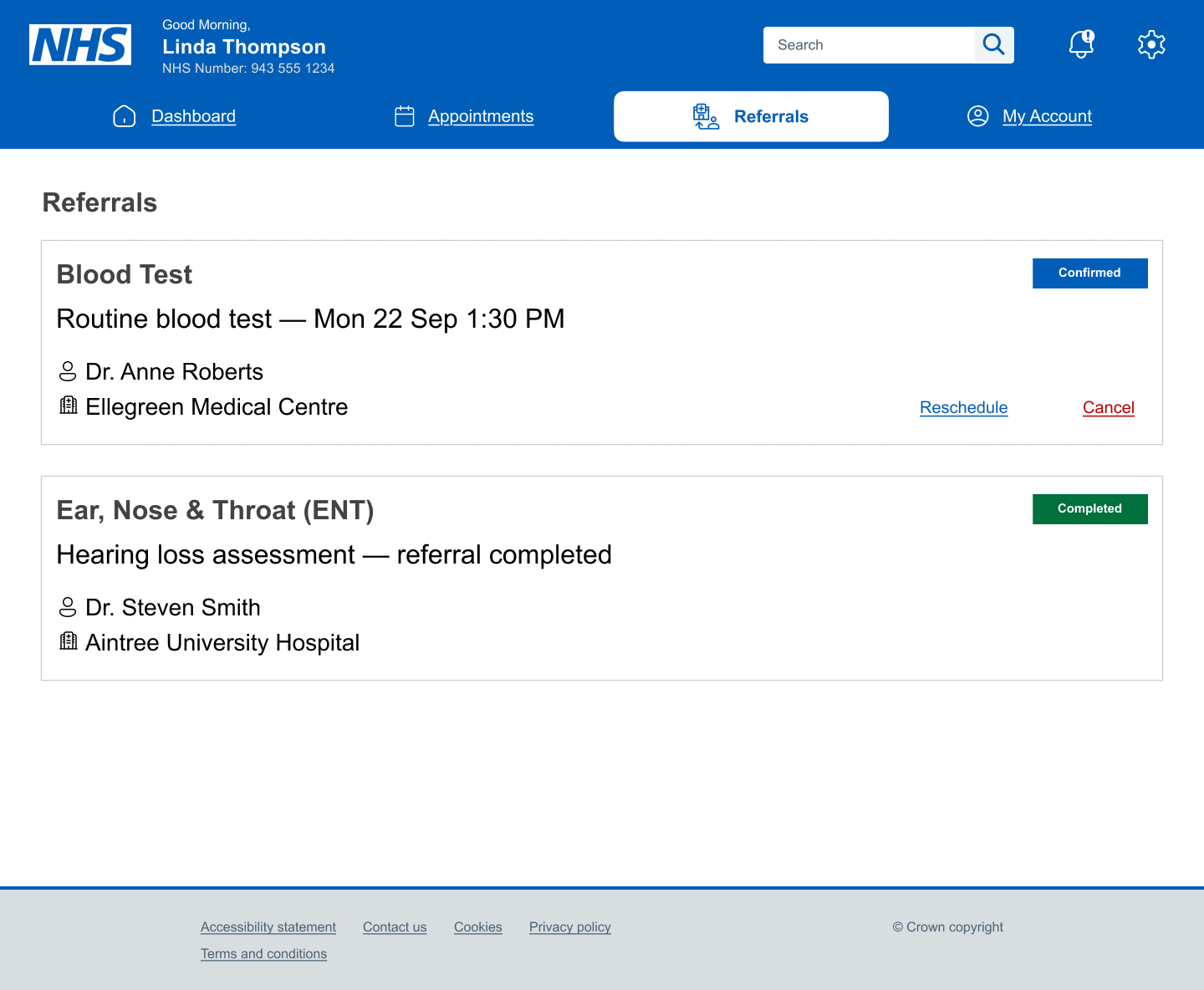
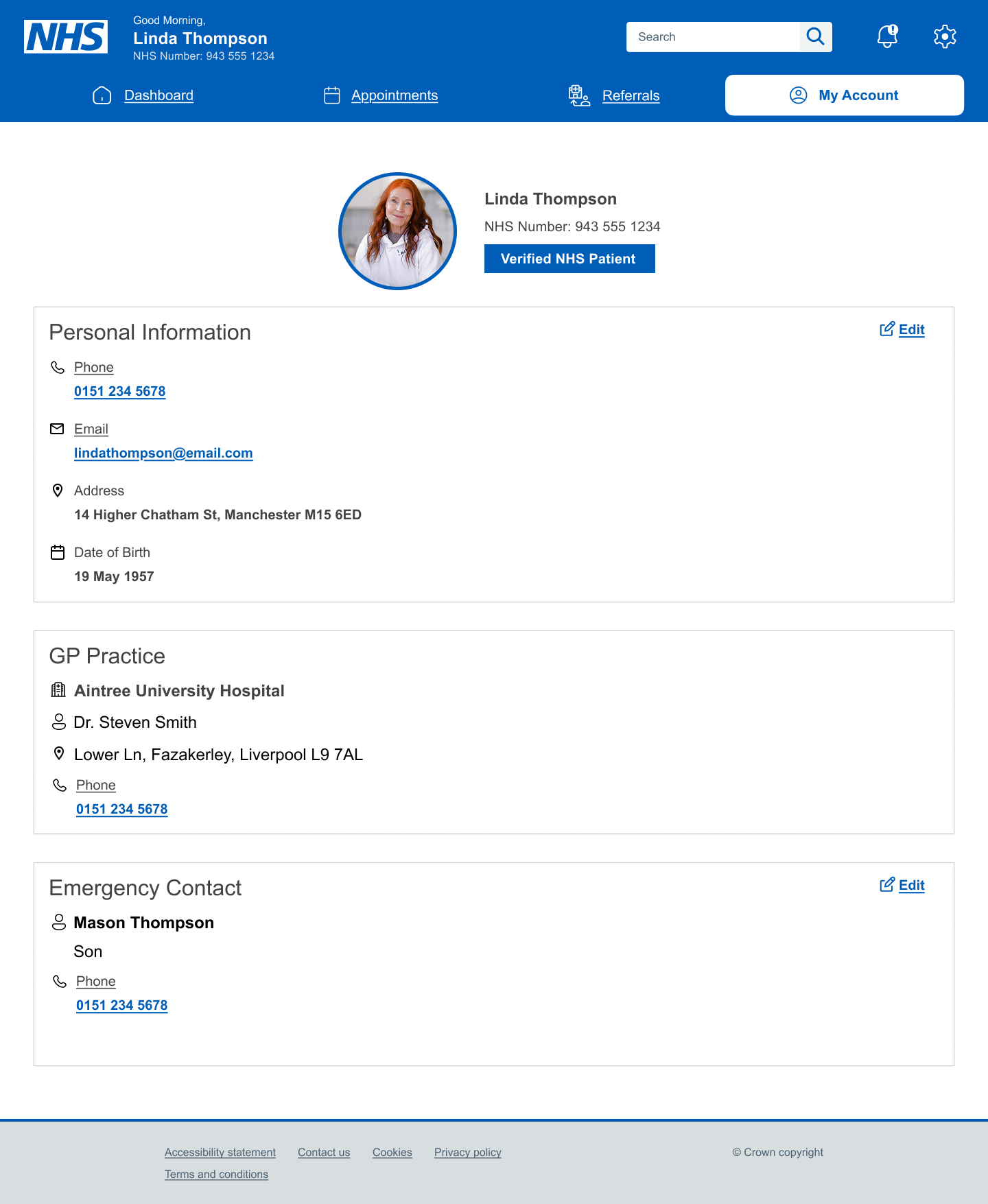
The final prototype presents a unified NHS booking app with a clear dashboard as the main entry point. It delivers transparent referral tracking, confident confirmations, and editable patient details to support accessibility and independence.
- Instant overview of appointments, referrals, prescriptions, and results
- Clear appointment confirmation and rescheduling
- Transparent referral tracking to remove the “black box” experience
- Verified NHS patient badge to reinforce trust
- Editable patient details to support accessibility needs
Prototype: View in Figma →
Want the full walkthrough?
Let’s set up a case study session. I’ll bring the prototypes and the stickman will bring snacks.
