Case Study
OLIO
A redesigned claiming experience that brings clarity, trust, and smoother pickup communication to OLIO’s community of neighbours sharing unused items.

01 — Overview
OLIO — UX Research & App Redesign
OLIO’s mission is to reduce waste by helping neighbours share surplus food. I explored the full claiming journey and redesigned it to feel clearer, faster, and more trustworthy.
02 — The Problem
Testing showed that the claiming journey produced hesitation and drop-off because the interface hid the very information people needed.
- Unclear item information
- Hidden filters and search
- Weak feedback after requesting
- Uncertainty around what happens next
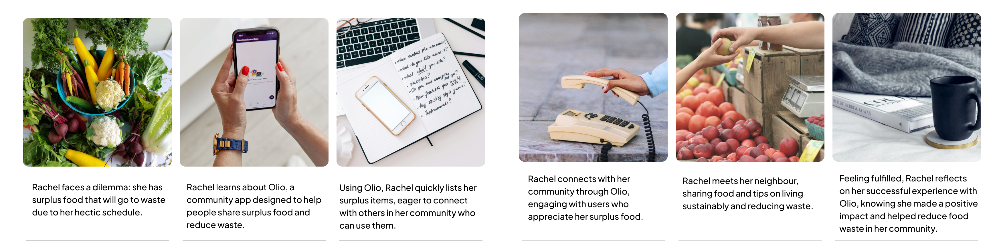
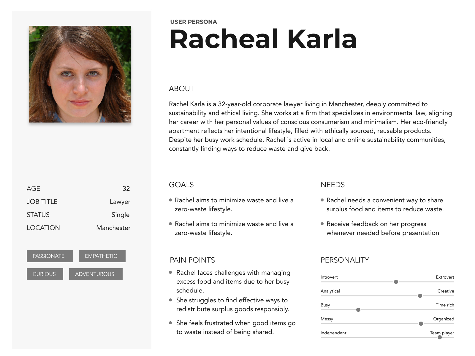 Persona.
03 — What Success Looked Like
Two success metrics guided every design decision:
- More items claimed per day — the flow is faster and easier.
- Higher repeat usage — users trust the experience.
To achieve these outcomes the UX needed to drive faster decisions, fewer errors, and higher confidence.
04 — Research & Key Insights
Competitor Analysis
Too Good To Go, Freecycle, and Vinted helped benchmark how pickups are structured, how trust is communicated, and how search/filtering is exposed. OLIO felt less predictable, less visually structured, and slower to understand.
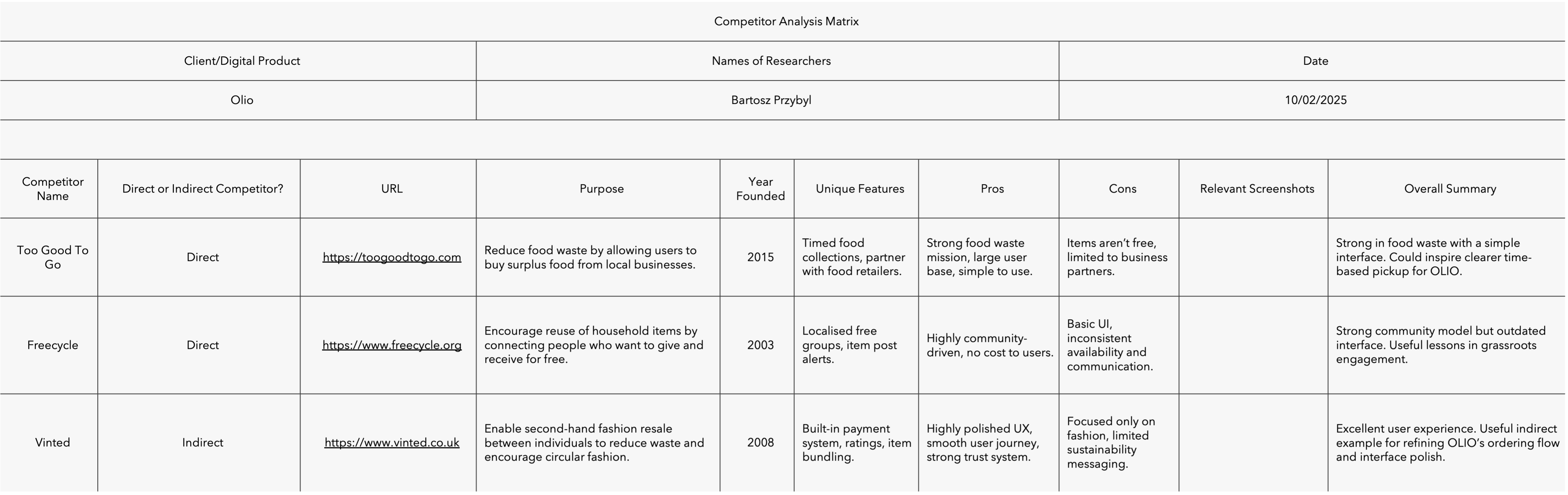 Competitor comparison board.
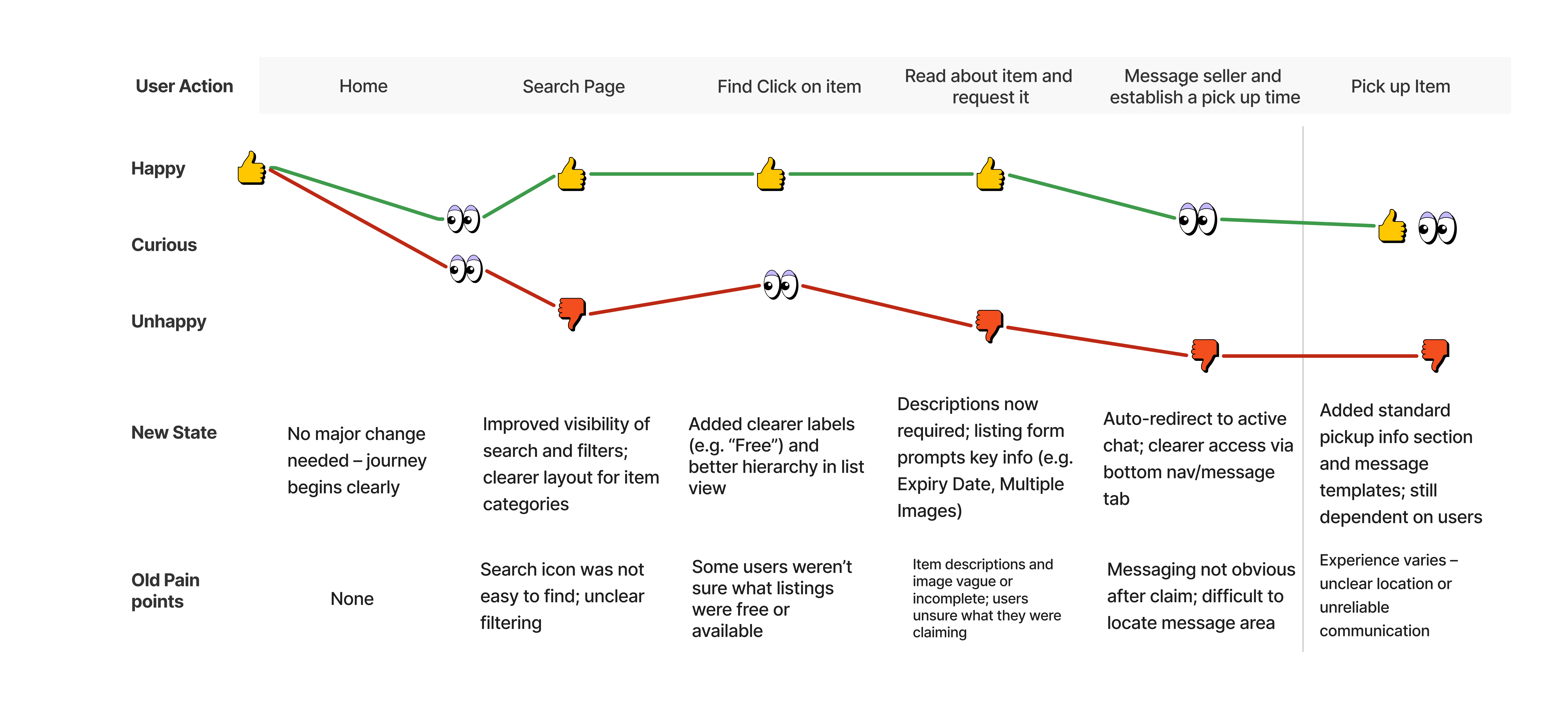
05 — Usability Issues Found
- Search was visually hidden.
- Item details lacked hierarchy.
- CTA feedback was unclear.
- Navigation cues felt inconsistent.
These moments of doubt appeared exactly when users should have felt confident pressing "Request."
06 — User Journey Redesign
The new journey emphasises clarity, confirmation, and predictability:
- Clear entry into search
- Structured, scannable item cards
- Guided transition into messaging
- Reduced uncertainty immediately after requesting
07 — Design System & Low-Carbon Approach
To keep the interface accessible and sustainable I used:
- White-heavy layouts to reduce OLED energy usage
- Minimal imagery/animation
- Reusable component library
- Optimised hierarchy and simplified navigation patterns
The result: faster load times, lower energy use, and better accessibility.
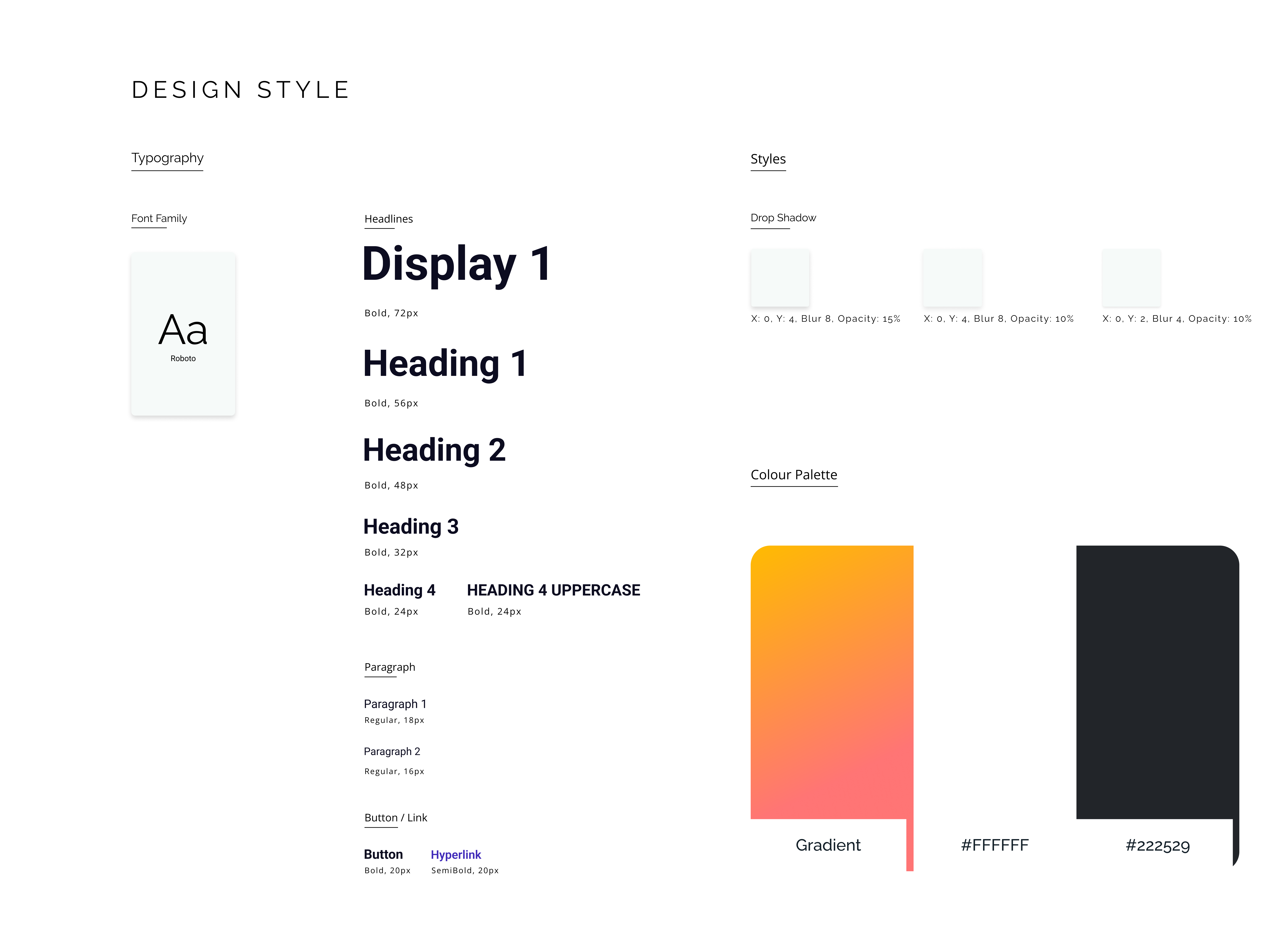 Style guide board.
08 — Key UX Improvements
Discovery & Browsing
- Prominent filters and search
- Cleaner, scannable item cards
- Visible map/list toggle
- Reduced visual clutter
Item Page & Order Flow
- Clear expiry + pickup info and a bold “Free” label
- Minimal form fields to keep requests quick
- Obvious primary CTA with supportive microcopy
Messaging & Pickup Coordination
- Chat opens instantly after requesting
- Location and pickup details stay inside the conversation
- Predictable inbox layout with clearer read states
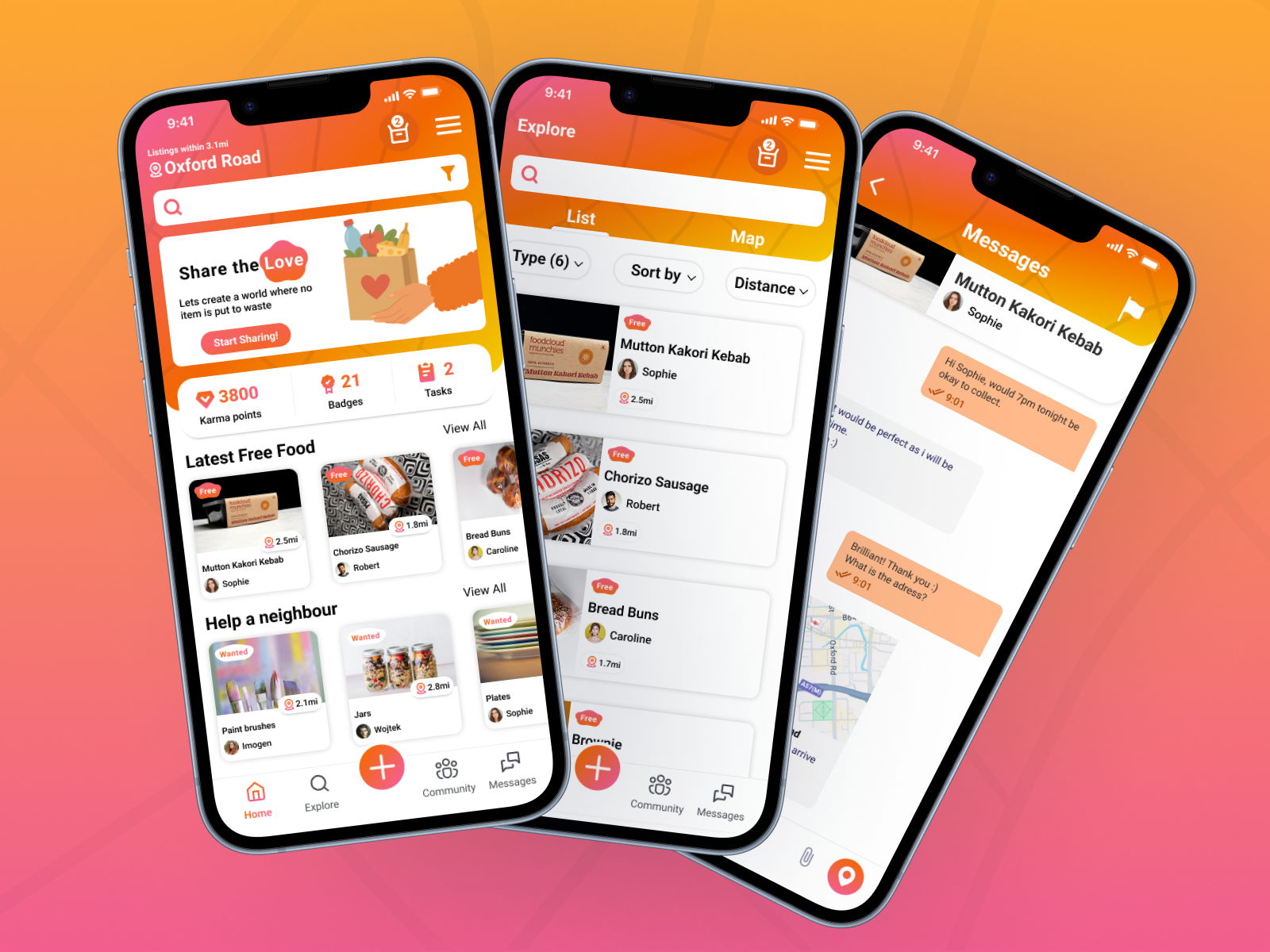
The collage below stitches these flows together so every improvement is visible at a glance.
Want to try the full clickable prototype? Explore it on Figma →
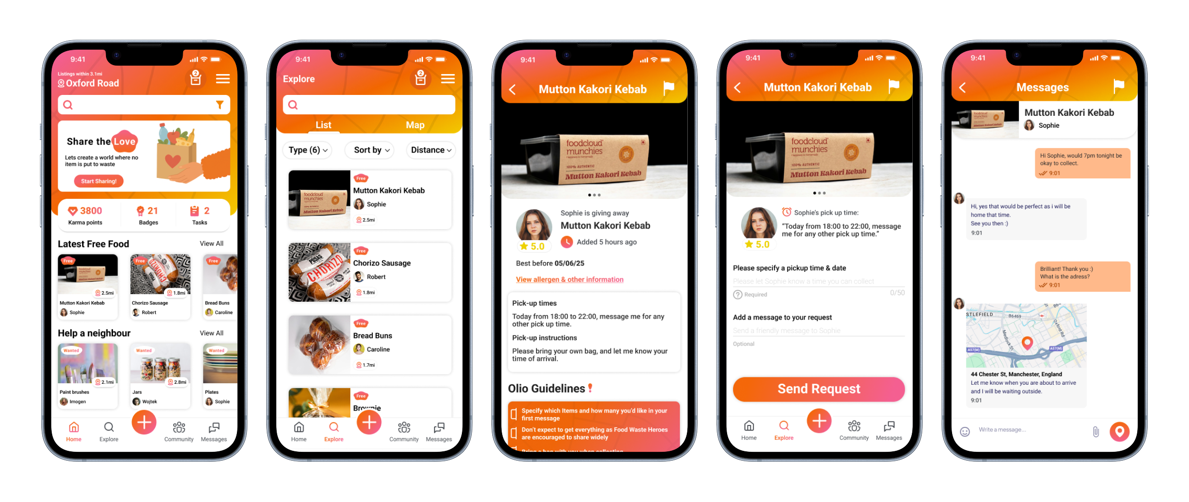 Key OLIO screens highlighting discovery, item, and messaging flows.
09 — Usability Testing
Participants: 2 UX students · 1 non-UX mobile user.
What Worked
- Clear layout
- Logical screen progression
- Easy messaging handoff
Needs Improvement
- No feedback after pressing “Request”
- Filters still too subtle
- Minor button inconsistencies
These insights informed better feedback states, icon visibility, and interaction consistency.
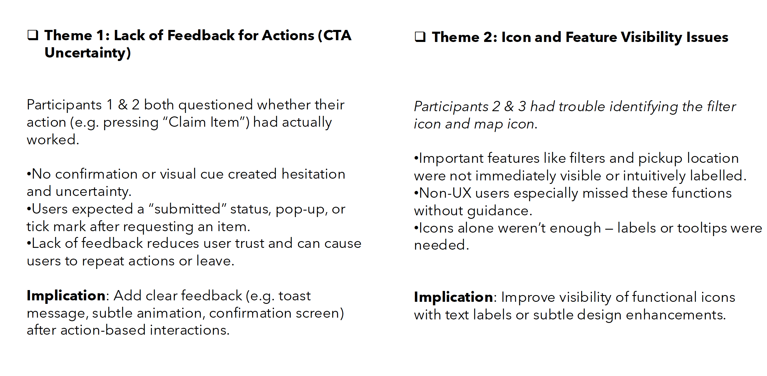 Testing notes.
10 — Final Outcome
- Faster item claiming
- Clear, predictable pickup flow
- Stronger trust cues
- Reduced hesitation
- Improved accessibility
- Low-carbon digital design
 Final high-fidelity OLIO overview.
11 — Reflection
This project strengthened my ability to translate research into practical UX decisions, design for trust, apply low-carbon thinking, and increase confidence through small UI changes. Clarity and feedback directly influenced how many items were successfully claimed.
Want to try the full clickable prototype? Explore it on Figma →
Want the full walkthrough?
Let’s set up a case study session. I’ll bring the prototypes and the stickman will bring snacks.